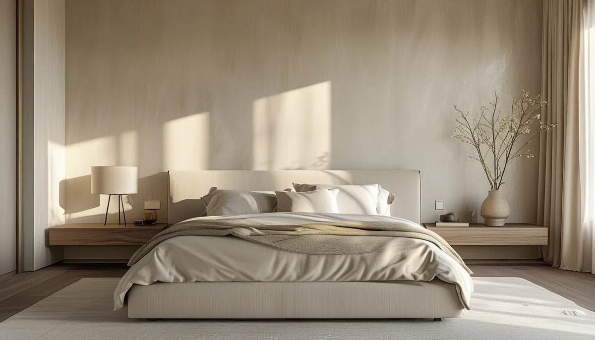
Beige is the hardest neutral to use on a single wall because it has almost no contrast to carry it. A navy accent wall works even when the shade is slightly off, since the sheer difference from the surrounding walls reads as intentional. A beige wall that is two steps warmer than the white next to it does not read as a design decision. It reads as a patch. Making beige work on one wall takes either a precise undertone relationship or a physical texture, and usually both.
Every beige has an undertone and it will show
What separates two beiges that look identical on a 2-inch chip is the secondary pigment underneath. There are four families worth knowing.
- Yellow-beige. The classic builder tone. Warm and forgiving under incandescent light, but it turns sallow next to cool gray flooring and it goes distinctly golden under 2700K bulbs at night.
- Pink-beige. Reads soft and flattering to skin, which is why it survives in bedrooms and powder rooms. It clashes hard with green-toned or red oak flooring, where the two pinks compete.
- Green-beige, sometimes labeled greige or sand. The most stable option under mixed light because green sits opposite the red-orange cast most lamps throw. It reads as taupe in dim light rather than turning muddy.
- Gray-beige. Cool and modern, and the one most likely to look flat and dead on a north-facing wall with no direct sun.
Identify the undertone by putting the sample next to a pure white card, not next to another beige. Against white, the secondary pigment separates immediately. Comparing two beiges to each other just makes the warmer one look warm and tells you nothing about which direction either one leans.
Pick the wall before you pick the color
An accent wall needs a reason to exist. The wall behind a bed headboard, the wall a sofa sits against, the chimney breast, or the end wall of a long narrow room all have architectural weight already. A wall broken up by two windows and a door does not, and painting it beige just chops the room into fragments.
Window direction changes the color more than the paint chip suggests. North-facing rooms in most of the US get flat, cool, indirect light all day, which drains warmth out of beige and pushes gray-beige toward gray-green. South-facing rooms get warm direct sun for hours and will amplify a yellow-beige into something close to butter by mid-afternoon. East-facing walls read warm in the morning and cool after lunch; west-facing walls do the opposite and go orange around 5 p.m. in summer.
Test accordingly. Paint two coats on a 2-foot square of poster board, not directly on the wall, and move it around: against the floor, next to the trim, on the wall at eye height, then look at it at 9 a.m., at 3 p.m., and again with only lamps on. A beige that survives all four checks is a beige you can commit to.
Light reflectance value is the other number worth reading off the back of the chip. LRV runs from 0 to 100, and most usable beiges land between 55 and 72. Above 72 the color washes out under direct sun and stops registering as an accent at all. Below about 50 it stops reading as beige and starts reading as mushroom or clay, which is a different and often better choice for an accent wall.
Texture is what makes a beige accent wall read as deliberate
Because beige carries so little contrast, the most reliable way to make one wall stand apart is to change the surface rather than only the color. Shadow does the work that pigment cannot.
Vertical fluted or slat paneling is the strongest option. Ribs projecting 1/2 to 3/4 inch from the wall cast a soft shadow line that shifts across the day, so the wall changes tone hour to hour while staying one color. Slat spacing between 1 and 2 inches reads contemporary; wider spacing reads more like traditional beadboard.
Picture frame molding divides a wall into rectangles with thin applied trim, usually 1/2 to 3/4 inch thick. Painted the same beige as the field, it produces crisp shadow lines with almost no color change. The layout rule that matters: keep the margin between boxes and the margin from the box to the ceiling and baseboard consistent, usually 4 to 6 inches, and make the bottom margin slightly larger than the top so the composition does not look like it is sliding down.
Grasscloth and woven-look wallcovering gives a beige wall real fiber texture and a subtle color variation panel to panel. That variation is inherent to the material, not a defect, and it is why a grasscloth accent wall never looks flat. In a bathroom or over a kitchen sink, use a vinyl-faced version rather than natural fiber.
Limewash and mineral-look finishes produce cloudy tonal movement within a single beige. They work best on a large uninterrupted wall, and they are unforgiving on a wall with a lot of cut-in edges, since the brush pattern has to resolve into something that looks intentional.
3D wall panels in a repeating relief pattern read as sculpture when painted a single beige, since there is no color competing with the geometry. Keep them on one wall only; a room with two panelled walls loses the accent effect entirely.
Trim, ceiling, and floor decide whether beige looks clean or dirty
The most common failure is not the beige at all. It is a bright cool white trim next to a warm beige wall. Against a blue-white, warm beige looks yellowed and slightly grubby, like white that has aged. Pair a warm beige with a soft or creamy white on the trim and the same wall color suddenly looks intentional.
Flooring is the second trap. Red oak with an orange cast fights pink-beige and yellow-beige both, because there are now three warm tones in the room with no hierarchy. Green-beige is the safest partner for orange-toned wood. Cool gray flooring, including most gray vinyl plank, wants a gray-beige or a greige on the wall, and it makes yellow-beige look distinctly dated.
Ceilings should almost always stay lighter than the accent wall. A beige ceiling above beige walls drops the apparent height of the room, and in a space under 9 feet that reads as heavy rather than cozy.
Sheen, and why it matters more on one wall than four
On an accent wall, sheen is contrast. Matte and flat finishes absorb light, hide drywall imperfections, and let a subtle beige recede, which is what you want behind a headboard. Eggshell reflects just enough to show the wall’s plane, which flatters molding and paneling. Satin and semi-gloss on a large beige wall are usually a mistake in a living space: the reflection reveals every roller lap and every taping flaw, and beige has no depth to disguise them.
If the wall has applied molding or slats, paint the whole assembly one sheen. Trim in semi-gloss against a matte field creates a second contrast that fights the shadow lines you built the wall for.
Where beige accent walls go wrong
- Too little contrast. If the accent is within about 10 LRV points of the adjacent walls, nobody registers it as an accent. Either widen the gap to 20 points or more, or add texture and keep the color identical.
- Choosing from a chip under store lighting. Retail fixtures are typically cool and very bright. Every beige looks cleaner there than it will in a lamp-lit bedroom.
- Accenting the wrong wall. The wall you see first when you enter, or the wall furniture is already anchored to, is the one that works. A random side wall reads as an unfinished paint job.
- Ignoring bulb temperature. Swapping 2700K bulbs for 3500K after painting will shift a warm beige toward gray and make a whole room look colder. Decide on bulb color before you commit to paint.
- One beige wall in a room already full of beige. Beige carpet, beige sofa, beige wall. At that point the accent has to come from texture or from a genuinely darker tone, not from another warm neutral.
The version of this that reliably looks good is narrow: one architecturally significant wall, a beige with a known undertone that agrees with the floor, a soft white on the trim, and a physical texture doing the heavy lifting. Skip any of the four and you get a wall people notice for the wrong reason.