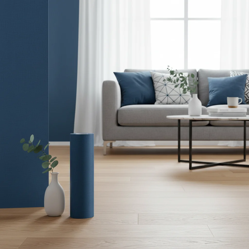
Solid blue wallpaper offers a sophisticated and versatile foundation for interior design, transforming spaces with its calming, dramatic, or invigorating presence. This enduring design choice, from the deepest navy to the softest sky blue, provides a singular, uninterrupted hue that can dramatically influence a room’s perceived size, mood, and overall aesthetic. Unlike patterned wallpapers, solid blue options derive their complexity from their specific shade, finish, and the way they interact with light and surrounding elements, presenting a powerful tool for defining architectural spaces and establishing a cohesive design narrative within any home.
Key Takeaways
- Solid blue wallpaper provides a versatile and impactful design element, capable of evoking moods from serene to dramatic depending on the chosen shade.
- Key considerations for selection include the room’s natural light, intended mood, existing furnishings, and the specific blue hue, ranging from deep indigos to light powder blues.
- Material choices such as non-woven, vinyl, or grasscloth significantly affect durability, texture, and ease of installation, with peel-and-stick options offering flexibility.
- Accurate measurement is crucial; always calculate square footage and account for waste, typically an additional 10-15%, even for solid designs.
- Styling solid blue wallpaper involves careful pairing with complementary colors (neutrals, metallics, contrasting brights) and textures to create a cohesive and visually rich environment.
- Regular, gentle cleaning with a soft, damp cloth is essential for maintaining the pristine appearance and longevity of solid blue wallpaper.
The Enduring Appeal of Solid Blue Wallpaper
Solid blue wallpaper possesses an enduring appeal in interior design due to its inherent versatility and profound psychological impact, making it a favored choice for creating spaces that range from tranquil retreats to bold statements. Blue is universally recognized for its calming properties, often associated with the sky and ocean, which contributes to feelings of serenity, stability, and peace within a home environment.
The timeless nature of blue allows it to transcend fleeting trends, offering a classic backdrop that remains relevant through changing styles. From the deep, grounding presence of navy to the airy, expansive feel of sky blue, a solid blue wall can dramatically alter the perception of a room. It provides a clean, sophisticated canvas that highlights furnishings and art without competing for attention, acting as a powerful unifier in a well-curated space.
Furthermore, solid blue offers an immediate sense of depth and richness that painted walls sometimes struggle to achieve, particularly with certain finishes. The subtle variations in texture and sheen inherent in many wallpapers add a layer of sophistication, elevating the overall design. This singular color choice can evoke a sense of luxury and thoughtful design, making it a compelling option for those seeking to infuse their homes with both style and substance.
At Starhouse, we understand the power of color to define a space. Our curation emphasizes how solid blue wallpaper can serve as an anchor, drawing the eye and providing a sense of cohesion to diverse design elements, from minimalist modern to traditional grandeur.
Decoding the Hues: Types of Solid Blue Wallpaper
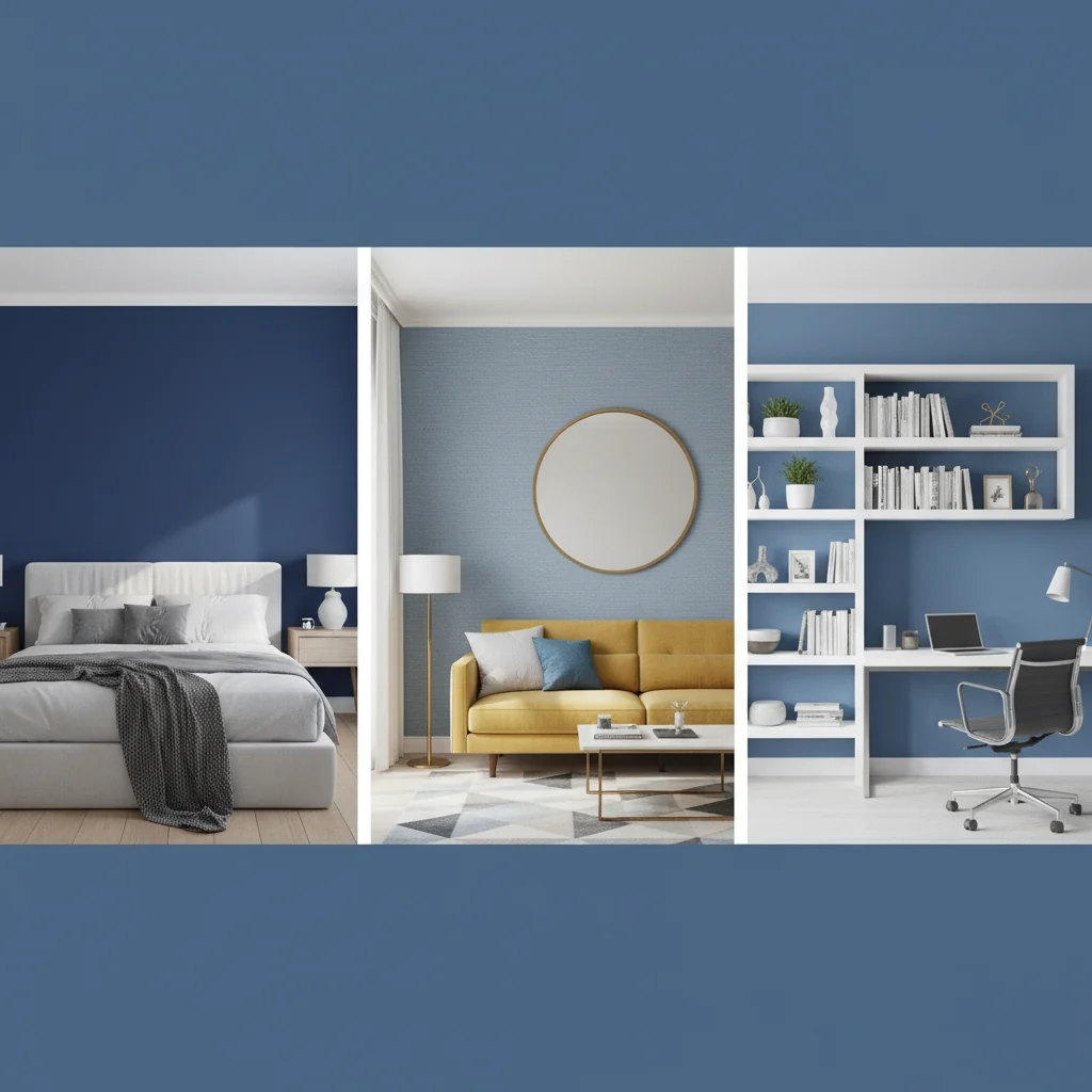
Solid blue wallpaper encompasses an expansive spectrum of shades, each possessing unique characteristics that can dramatically influence a room’s atmosphere, from creating a sense of serene calm to evoking vibrant energy or profound depth. Understanding these distinct hues is paramount for selecting the perfect blue to complement your design vision and the specific conditions of your space.
The psychological impact and aesthetic contribution of each blue shade are significant. Lighter blues, such as sky blue or powder blue, tend to expand a space, making it feel more open and airy, ideal for smaller rooms or areas with limited natural light. Conversely, deeper blues, like navy or indigo, create a sense of intimacy and sophistication, often lending a dramatic and enveloping feel, best suited for larger rooms or accent walls.
Consider the following prominent solid blue hues and their typical effects:
- Navy Blue: A deep, rich, and classic shade, navy blue evokes sophistication, stability, and a sense of grounding. It is excellent for creating a luxurious, tailored feel in living rooms, studies, or formal dining areas. Navy pairs exceptionally well with brass, white, and warm wood tones.
- Sky Blue: Light and ethereal, sky blue brings a feeling of openness, tranquility, and freshness. It is perfect for bedrooms, bathrooms, or nurseries, fostering a serene and airy atmosphere. It works beautifully with natural textures, whites, and soft grays.
- Teal: A captivating blend of blue and green, teal is vibrant and exotic, often associated with tropical waters and precious jewels. It can be invigorating yet calming, suitable for accent walls in living spaces or for adding a distinctive touch to a home office. Teal complements gold, deep browns, and creams.
- Sapphire Blue: A vivid, jewel-toned blue, sapphire is regal and luxurious, conveying depth and intensity. It makes a bold statement in any room, particularly effective in entertaining spaces or for creating a focal point. Silver, black, and crisp white enhance its brilliance.
- Periwinkle: A soft, delicate blend of blue and violet, periwinkle is charming and whimsical, offering a gentle yet distinct character. It’s ideal for creating a romantic or playful ambiance in bedrooms, guest rooms, or creative studios. It harmonizes with pastels, light woods, and soft metallics.
- Indigo: Deeper than navy, indigo is a profound, almost mystical blue with subtle hints of violet, imparting a sense of depth, wisdom, and creativity. It is excellent for creating a dramatic, enveloping space, perfect for media rooms, libraries, or serene master bedrooms. It pairs well with natural fibers, deep reds, and earthy tones.
- Cerulean: A bright, medium-to-dark blue, cerulean is vibrant and inspiring, reminiscent of a clear summer sky. It can energize a space while retaining a sense of calm, suitable for creative spaces, children’s rooms, or lively living areas. It pops with orange, yellow, and crisp white.
- Dusty Blue: A muted, desaturated blue with undertones of gray, dusty blue is sophisticated, understated, and incredibly versatile. It offers a soft, calming presence without being overly bold, fitting seamlessly into various design aesthetics from farmhouse to modern minimalist. It complements warm neutrals, blush pinks, and matte black accents.
The choice of a specific blue shade profoundly impacts the overall design narrative. When selecting, consider the amount of natural light the room receives, as this will dramatically alter how the color appears throughout the day. A blue that looks perfect in a brightly lit showroom might appear darker or more muted in a room with less light. Always obtain samples and observe them in your space under different lighting conditions before making a final decision.
Materials and Construction: Understanding Your Options
The material composition of solid blue wallpaper significantly impacts its durability, texture, ease of installation, and overall aesthetic, making it a critical factor in your selection process. Each material offers distinct advantages and is suited for different applications and environments within the home, influencing both the tactile experience and the longevity of your wallcovering.
Understanding these material differences ensures you choose a wallpaper that not only looks beautiful but also performs optimally for your specific needs. From moisture resistance in high-humidity areas to tactile warmth in living spaces, the substrate plays a pivotal role.
Here, we define and differentiate the primary types of wallpaper materials:
- Non-Woven Wallpaper: This is a modern, high-performance material made from a blend of natural and synthetic fibers. Non-woven wallpaper is dimensionally stable, meaning it resists shrinking and expanding, making it exceptionally easy to install and remove without damaging walls. It is also breathable, which helps prevent mold and mildew, and often washable. This material is an excellent choice for almost any room, including bathrooms and kitchens, due to its durability and moisture resistance.
- Vinyl Wallpaper: Vinyl wallpaper is a highly durable and washable wallcovering, constructed with a paper or fabric backing coated in polyvinyl chloride (PVC). This PVC layer provides superior resistance to moisture, stains, and abrasion, making it ideal for high-traffic areas like hallways, kitchens, and bathrooms. Vinyl wallpapers are available in various weights and textures, including solid vinyl and vinyl-coated paper. They are generally easy to clean but can be less breathable than non-woven options.
- Paper Wallpaper: The traditional form of wallpaper, paper wallpaper, is made entirely from paper pulp. It offers a classic aesthetic and can be quite delicate, often requiring careful handling during installation. While less durable and generally not washable compared to vinyl or non-woven options, paper wallpapers can provide a unique matte finish and absorb color beautifully. They are best suited for low-traffic areas like bedrooms or formal living rooms where moisture and wear are minimal.
- Grasscloth Wallpaper: Grasscloth wallpaper is a natural, textural wallcovering made from woven natural fibers such as jute, sisal, or seagrass, typically backed with paper. It introduces organic texture and subtle variations in color, even in a solid blue, adding depth and warmth to a room. Grasscloth is inherently delicate, not washable, and susceptible to moisture, making it best for low-traffic, dry areas like dining rooms or bedrooms. Its natural variations are part of its charm and should be embraced.
- Fabric-Backed Wallpaper: This type features a fabric substrate (e.g., cotton, linen, silk) laminated to a paper or non-woven backing. Fabric-backed wallpapers offer a luxurious, soft tactile quality and excellent durability. They are often more expensive and can be more challenging to install due to their weight and flexibility. They are an excellent choice for adding a sophisticated, textile-like finish to formal living rooms, master bedrooms, or accent walls.
When selecting your solid blue wallpaper, consider the practical requirements of the space. For example, a bathroom or kitchen demands a material with high moisture resistance and washability, making vinyl or non-woven ideal. For a formal dining room or bedroom, where tactile quality and aesthetic depth are prioritized over extreme durability, grasscloth or fabric-backed options might be more appropriate. Always check the manufacturer’s specifications for washability, scrubbability, and lightfastness to ensure the material aligns with your lifestyle and maintenance expectations.
Application Methods: Traditional vs. Peel-and-Stick
The method of wallpaper application significantly influences the installation process, commitment level, and potential for future removal, with traditional paste-the-wall or paste-the-paper options contrasting sharply with modern peel-and-stick alternatives. Your choice between these two primary methods should align with your DIY comfort level, the desired permanence of the installation, and the specific characteristics of your walls.
Traditional wallpaper, whether pre-pasted, unpasted, or paste-the-wall, generally offers a more permanent and durable finish, often preferred for long-term design commitments. Peel-and-stick wallpaper, conversely, provides unparalleled convenience and flexibility, making it ideal for renters, temporary updates, or those who enjoy frequent design changes.
Here is a comparison of these two distinct application approaches:
| Feature | Traditional Wallpaper (Unpasted/Pre-pasted/Paste-the-Wall) | Peel-and-Stick Wallpaper |
|---|---|---|
| Adhesive Type | Requires separate adhesive (unpasted) or has adhesive activated by water (pre-pasted). Paste-the-wall options apply paste directly to the wall. | Self-adhesive backing, protected by a liner, activated upon peeling. |
| Installation Difficulty | Moderate to High. Requires precise paste application, booking (for unpasted), and careful alignment. Can be messy. Professional installation often recommended for large areas. | Low to Moderate. Generally easier for DIYers. Requires careful alignment and smoothing to avoid bubbles. Less mess. |
| Permanence | High. Designed for long-term application. Adheres strongly to walls. | Low to Moderate. Designed for easy, temporary removal without damaging walls or leaving residue. |
| Removal | Can be challenging; may require steaming, stripping, or specific wallpaper removers. Can sometimes damage drywall if not removed properly. | Easy and clean. Simply peel off from a corner. Ideal for renters or frequent redecorators. |
| Durability | High, especially for vinyl and non-woven types. Excellent longevity when properly installed. | Good, but may be slightly less durable or prone to edge lifting in high-traffic areas compared to traditional, permanently adhered options. |
| Wall Preparation | Requires clean, smooth, primed walls. Specific primers may be needed depending on wall type and wallpaper material. | Requires clean, smooth, non-textured, and often painted walls. Not suitable for textured surfaces or fresh, unprimed paint. |
| Cost (per roll) | Varies widely, from $30-$300+ USD, plus cost of adhesive and tools. | Varies, typically $25-$150+ USD, often including all necessary adhesive. |
| Ideal Use | Permanent installations, high-traffic areas, formal rooms, or when maximum durability is required. | Rentals, temporary decor updates, accent walls, DIY projects, or for those who like to change designs frequently. |
When considering traditional wallpaper, particularly an unpasted solid blue wallcovering, the quality of the adhesive is as important as the wallpaper itself. A high-quality, professional-grade wallpaper paste ensures optimal adhesion and longevity. For pre-pasted options, ensuring the wall is adequately prepared and the paper is thoroughly wet is crucial for proper activation of the adhesive.
Peel-and-stick, also known as removable wallpaper, has advanced significantly in recent years. Peel-and-stick wallpaper is a self-adhesive wallcovering that features a removable backing, allowing for easy application and repositioning without the need for additional paste. Modern peel-and-stick materials offer a wide array of finishes and textures, including solid blue options that mimic the look of traditional papers. While generally forgiving, precise alignment is still key to a seamless finish, especially for large expanses of solid color where imperfections are more noticeable.
Regardless of the method, proper wall preparation is non-negotiable. Walls must be clean, dry, smooth, and preferably primed to ensure optimal adhesion and a professional finish. Any imperfections on the wall, such as holes or bumps, will be magnified under a solid color wallpaper.
Selecting the Perfect Blue: Guiding Your Choice
Selecting the perfect solid blue wallpaper involves a nuanced consideration of various environmental and personal factors, ensuring the chosen hue harmonizes with your space and fulfills your aesthetic aspirations. This deliberate process moves beyond mere preference, integrating practical elements like natural light, room function, and existing decor to achieve a cohesive and impactful design.
The “perfect” blue is not a universal shade but rather the one that most effectively translates your vision for a room into a tangible reality. It requires a thoughtful evaluation of how the color will interact with its surroundings and how it will make you feel.
Consider the following guiding principles:
-
Assess Natural Light: The amount and quality of natural light a room receives profoundly impacts how a solid blue wallpaper appears.
- North-facing rooms: These rooms tend to have cooler, dimmer light. Opt for warmer blues (e.g., dusty blue with gray undertones, or blues with a hint of green) or lighter, brighter blues (e.g., sky blue) to prevent the space from feeling too cold or dark.
- South-facing rooms: Bathed in bright, warm light, these rooms can handle deeper, cooler blues like navy or sapphire without feeling overwhelming. The warm light will prevent these shades from appearing too stark.
- East-facing rooms: Receive bright, warm light in the morning and cooler light in the afternoon. A medium blue, like a serene cerulean or a muted periwinkle, can adapt well to these changing conditions.
- West-facing rooms: Experience warm, intense light in the afternoon and evening. Deeper blues can be particularly stunning here, appearing rich and inviting as the light shifts.
-
Consider Room Function and Desired Mood: The purpose of the room should dictate the emotional impact you wish to achieve with your blue.
- Bedrooms: For tranquility and rest, opt for softer, muted blues (e.g., dusty blue, powder blue, light indigo).
- Living Rooms: Depending on the desired ambiance, a sophisticated navy can create a formal, elegant space, while a vibrant teal can inject energy and personality.
- Bathrooms: Light, airy blues (e.g., sky blue, cerulean) are refreshing and clean. Vinyl options are recommended for moisture resistance.
- Home Offices/Studies: Deeper blues like indigo or navy can promote focus and a sense of gravitas.
-
Evaluate Existing Furnishings and Decor: Your solid blue wallpaper should complement, not clash with, your current furniture, flooring, and artwork.
- Warm Tones: If your room features warm woods, creams, or golds, consider blues with green undertones (e.g., teal) or classic navy for a sophisticated contrast.
- Cool Tones: If grays, whites, or silvers dominate, a pure blue or a blue with violet undertones (e.g., sapphire, periwinkle) can enhance the cool palette.
- Bold Colors: If you have vibrant accent pieces, a muted or mid-tone solid blue can provide a calming backdrop, allowing the accents to pop without overwhelming the space.
- Test Samples Extensively: This is arguably the most critical step. York Wallcoverings emphasizes the transformative power of blue wallpaper in various shades, highlighting the importance of seeing how the color interacts with your specific environment. Order large samples (at least 12×12 inches) of your top choices and affix them to different walls in the room. Observe them throughout the day and evening, under both natural and artificial light. This process reveals how the color shifts and ensures there are no unwelcome surprises.
-
Consider the Finish: Solid blue wallpaper comes in various finishes, from matte to high-gloss.
- Matte: Absorbs light, creating a soft, sophisticated, and understated look. Hides imperfections well.
- Satin/Eggshell: Offers a subtle sheen, reflecting some light, adding a touch of elegance and making the color appear richer. More durable than matte.
- Gloss/High-Gloss: Highly reflective, creating a dramatic, modern, and sometimes glamorous effect. Tends to highlight wall imperfections.
By meticulously addressing these factors, you can confidently select a solid blue wallpaper that not only beautifies your space but also aligns perfectly with its functional and aesthetic requirements, ensuring a harmonious and inviting interior.
Precision in Planning: Sizing and Measuring for Success
Accurate sizing and meticulous measurement are indispensable steps in any wallpaper project, particularly with solid blue wallpaper where seamlessness is paramount, preventing costly errors and ensuring a professional, uninterrupted finish. Precise calculations ensure you purchase the correct quantity of rolls, minimizing waste while guaranteeing sufficient material to complete your installation without unexpected shortages.
Underestimating can lead to delays and potential color batch variations if additional rolls must be ordered, while overestimating results in unnecessary expense. The process, while seemingly straightforward, requires careful attention to detail.
Follow these precise steps for sizing and measuring:
-
Measure Room Dimensions:
- Height: Measure the height of each wall from the floor to the ceiling. Take measurements at several points across the wall, especially if your ceiling or floor is uneven, and use the greatest height for your calculations.
- Width: Measure the total perimeter of the room, adding the widths of all walls you plan to wallpaper.
-
Calculate Total Square Footage:
- Multiply the total perimeter (in feet) by the maximum wall height (in feet) to get the total square footage to be covered.
- Example: A room with a total wall width of 40 feet and a height of 8 feet requires 320 sq ft of coverage.
-
Account for Doors and Windows:
- Measure the height and width of all doors and windows. Calculate their individual square footage.
- Subtract the total square footage of doors and windows from the room’s total square footage. While this is helpful for a precise estimate, most professionals recommend *not* subtracting small openings, as the cut pieces around them often cannot be fully utilized elsewhere. For large openings, a partial subtraction is prudent.
-
Determine Wallpaper Roll Coverage:
- Check the label of your chosen solid blue wallpaper for its stated coverage per roll. This is typically provided in square feet or square meters. Standard U.S. rolls often cover approximately 56 sq ft (a single roll) or 112 sq ft (a double roll).
-
Factor in Waste and Repeat (Even for Solids):
- Even with solid colors, a waste factor is crucial for proper installation. You will need extra material for trimming, matching edges, and correcting errors.
- Add a minimum of 10-15% for waste. For rooms with many architectural features, angles, or very high ceilings, consider adding 15-20%. This buffer is vital to ensure you have enough material.
- While solid blue wallpaper doesn’t have a pattern repeat in the traditional sense, slight variations in color tone between rolls (dye lots) or minor imperfections can necessitate careful cutting and alignment. Having extra material from the same dye lot is essential for consistency.
-
Calculate Number of Rolls:
- Divide your adjusted total square footage (including waste) by the square footage coverage of one roll.
- Example: 320 sq ft (room) + 32 sq ft (10% waste) = 352 sq ft needed. If a roll covers 56 sq ft, you need 352 / 56 ≈ 6.28 rolls. Always round up to the nearest whole roll, so 7 rolls in this example.
-
Consider Vertical Strips:
- Alternatively, calculate how many full-height strips you can get from one roll. Divide the roll length by the wall height (plus a few inches for trimming). Then divide the total wall width by the wallpaper width to find the number of strips needed. This method can sometimes be more precise for complex rooms.
Always purchase all rolls from the same dye lot to ensure color consistency, as even solid colors can have subtle variations between production batches. This dye lot number is usually printed on the wallpaper label. Store unused, unopened rolls in a cool, dry place; they can be invaluable for future repairs or touch-ups.
Styling with Solid Blue: Creating Cohesive Interiors
Styling with solid blue wallpaper provides a powerful opportunity to craft cohesive and sophisticated interiors, leveraging its singular hue to define mood, highlight architectural features, and unify diverse design elements. The absence of a pattern allows the blue itself to become the focal point, demanding thoughtful consideration of complementary colors, textures, and furniture styles to achieve a balanced and intentional aesthetic.
A solid blue wall acts as a foundational element, capable of transforming a room from ordinary to extraordinary. Its versatility means it can serve as a serene backdrop or a dramatic statement, depending on the shade and how it is accented.
Here are precise strategies for styling with solid blue wallpaper:
-
Complementary Color Palettes:
- Neutrals (White, Cream, Gray, Beige): These are classic pairings that allow solid blue to shine. Crisp white trim against navy creates a nautical or tailored look. Soft grays and creams with dusty blue evoke calm sophistication. Beige and natural linen with sky blue create a serene, earthy atmosphere.
- Warm Metals (Brass, Gold, Copper): The richness of brass or gold against deep blues like navy or indigo creates a luxurious, opulent contrast. This pairing is particularly effective in traditional or Art Deco-inspired spaces.
- Cool Metals (Silver, Chrome, Stainless Steel): These metals provide a sleek, modern contrast to all shades of blue, enhancing a contemporary or minimalist aesthetic.
- Earthy Tones (Terracotta, Rust, Olive Green): For a more organic, grounded feel, pair blues (especially teal, cerulean, or muted navy) with warm, earthy hues. This creates a balanced, nature-inspired palette.
- Contrasting Brights (Yellow, Orange, Coral): For a bolder, more energetic space, introduce pops of vibrant yellow, orange, or coral. A mustard yellow cushion on a sofa against a sapphire blue wall, for example, creates dynamic visual interest.
- Monochromatic Harmony: Use varying shades of blue within the same room. A navy wall with lighter blue textiles or deeper blue accents creates depth and sophistication without overwhelming the eye.
-
Integrating Textures:
Texture is crucial for adding dimension to a solid color scheme.
- Natural Fibers: Introduce linen, jute, wool, and cotton through rugs, throws, and upholstery. These soften the visual impact of a solid wall and add organic warmth.
- Velvet and Silk: For luxury and depth, incorporate velvet sofas, silk curtains, or decorative pillows. The way these materials catch light enhances the richness of a deep blue wall.
- Wood and Stone: Natural wood furniture (light oaks, dark walnuts) or stone accents (marble, granite) provide grounding elements and textural contrast.
- Metallics: Beyond color, the sheen of metallic accents (lamps, frames, decorative objects) adds another layer of texture and visual interest.
-
Furniture Styles and Placement:
- Modern Minimalist: Clean-lined furniture in neutral tones allows a solid blue wall to become the artistic statement. A simple, low-profile sofa against a deep blue wall creates a striking, uncluttered look.
- Traditional Elegance: Classic furniture pieces with ornate detailing, upholstered in complementary fabrics, pair beautifully with rich navy or sapphire blues. Dark wood furniture enhances the formality.
- Coastal/Nautical: Light, airy blues (sky blue, cerulean) are perfect for coastal themes, paired with distressed white furniture, wicker, and natural wood accents.
- Accent Wall vs. Entire Room:
- Accent Wall: Ideal for introducing a bold blue without overwhelming the space. Use it to highlight a focal point, such as behind a bed, a fireplace, or a gallery wall. This is a powerful way to define zones in an open-concept living area.
- Entire Room: For a truly immersive experience, covering all walls in a solid blue creates a cocoon-like effect. This works exceptionally well in bedrooms for a calming retreat or in dining rooms for a dramatic, enveloping ambiance. Ensure adequate lighting and complementary furnishings to prevent the room from feeling too dark or enclosed.
-
Lighting Considerations:
- Layered Lighting: Combine ambient (general room light), task (reading lights), and accent lighting (spotlights on art) to bring out the nuances of the blue and prevent a flat appearance.
- Warm vs. Cool Tones: Warm-toned bulbs (2700K-3000K) can make blue appear richer and more inviting, while cooler bulbs (4000K+) can make it feel crisper and more contemporary.
By thoughtfully combining these elements, you can transform a simple solid blue wall into the cornerstone of a beautifully designed and emotionally resonant interior. The key is to balance the intensity of the blue with a variety of textures, complementary colors, and appropriate lighting to create a space that feels both harmonious and uniquely yours.
As you envision your perfect blue-hued sanctuary, Starhouse is committed to curating a collection that empowers your design aspirations. We invite you to tell us what you’re looking for in your space, and get early access to our upcoming offerings.
Current Trends in Solid Blue Wallpaper Design
Current trends in solid blue wallpaper design lean towards both deep, immersive hues that create sophisticated, enveloping spaces and lighter, muted tones that foster tranquility and airiness, reflecting a broader desire for both comfort and understated elegance in home interiors. These trends are often influenced by a renewed appreciation for natural elements, minimalist aesthetics, and the psychological impact of color within living environments.
The versatility of blue allows it to adapt to various contemporary design philosophies, making it a perennial favorite that constantly redefines its presence in modern homes.
Key trends to observe include:
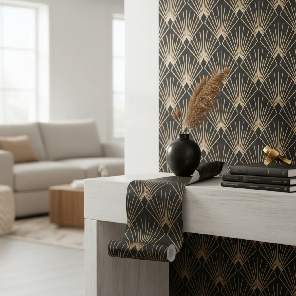
- The Rise of “Quiet Luxury” with Muted Blues: Soft, desaturated blues, often with gray or green undertones (e.g., dusty blue, muted teal, pale indigo), are gaining prominence. These shades contribute to a “quiet luxury” aesthetic, prioritizing understated elegance, comfort, and timelessness over overt opulence. They provide a sophisticated backdrop that allows high-quality furnishings and curated art to stand out.
- Deep, Immersive Blues for Statement Walls and Cocooning Spaces: Navy, deep sapphire, and rich indigo are increasingly used to create dramatic accent walls or to envelop entire rooms, particularly in bedrooms, studies, and dining areas. This trend embraces the idea of a “cocooning” effect, where deep colors create a sense of intimacy, warmth, and sanctuary, offering a departure from all-white interiors.
- Textural Finishes for Added Depth: While the color remains solid, the trend emphasizes textural nuances in the wallpaper material. Grasscloth, linen-textured vinyl, or subtle embossed patterns (barely visible except up close) in solid blue add tactile interest and depth without introducing a visual pattern. This adds a layer of sophistication, preventing the solid color from appearing flat.
- Biophilic Design Integration with Blues: Blues with strong green undertones (e.g., deep teal, blue-green) are popular in biophilic design, which seeks to connect occupants with nature. These shades pair beautifully with natural wood tones, abundant houseplants, and organic materials, fostering a calming, nature-inspired environment.
- Monochromatic and Tonal Schemes: Designers are increasingly utilizing solid blue wallpaper as the foundation for monochromatic or tonal interior schemes. This involves pairing the wallpaper with furniture, textiles, and decor in varying shades of blue, or blues with subtle shifts in hue and saturation. This approach creates a sophisticated, layered look that is both harmonious and visually rich.
- Pairing with Warm Neutrals and Metallics: Solid blue walls are frequently being paired with warm neutral tones (creamy whites, soft beiges, warm grays) and metallic accents (brass, brushed gold). This combination adds warmth and a touch of glamour, preventing the cool tones of blue from feeling too stark. The contrast between cool blue and warm metals is particularly impactful.
- Solid Blue as a Backdrop for Art and Collectibles: In gallery-style homes, solid blue wallpaper, especially deeper shades, serves as an exquisite backdrop for displaying artwork, photography, or curated collections. The uniform color allows the art to truly pop and become the focal point, enhancing its visual impact.
These trends highlight the enduring versatility of solid blue wallpaper, proving its capacity to remain a relevant and impactful choice in contemporary interior design. By integrating these current approaches, homeowners can create spaces that are both stylish and deeply personal.
Maintaining Your Investment: Care and Longevity
Proper care and maintenance are essential for preserving the pristine appearance and extending the longevity of your solid blue wallpaper, protecting your investment and ensuring its beauty endures for years. Different wallpaper materials require specific cleaning protocols, and adhering to these guidelines prevents damage, discoloration, and premature wear, ensuring your walls remain a stunning feature of your home.
Neglecting proper care can lead to dullness, stains, or even damage to the wallpaper’s surface. Understanding the classification of your wallpaper is the first step.
Follow these precise care and longevity practices:
-
Identify Your Wallpaper Material and Washability:
- Non-Woven and Vinyl: Most solid blue wallpapers made from these materials are washable or scrubbable. This means they can withstand gentle cleaning with a damp cloth and mild detergent.
- Paper: Generally not washable. For minor dust, a very light dusting with a dry, soft cloth is the most you can do. Any liquid will likely cause damage.
- Grasscloth: Not washable. Extremely sensitive to moisture. Dust gently with a dry, soft cloth or a soft brush attachment on a vacuum cleaner. Any spills should be blotted immediately, but stains are often permanent.
- Fabric-Backed: Care varies depending on the fabric. Some may be gently spot-cleaned, while others are dry-clean only. Always consult manufacturer instructions.
-
Regular Dusting:
- For all wallpaper types, regular dusting is crucial to prevent dirt and grime buildup. Use a soft, dry cloth, a feather duster, or a vacuum cleaner with a soft brush attachment on a low setting. Dust from top to bottom.
-
Spot Cleaning (for washable wallpapers):
- For washable vinyl or non-woven solid blue wallpaper, address spills and marks immediately.
- Use a clean, soft sponge or cloth dampened with lukewarm water and a very small amount of mild, non-abrasive soap (e.g., dish soap).
- Gently blot the stained area, working from the outside in to prevent spreading. Do not rub vigorously, as this can damage the surface or push the stain deeper.
- Rinse the area with a clean cloth dampened with plain water to remove any soap residue.
- Pat dry with a clean, dry cloth.
- Always test cleaning solutions on an inconspicuous area first to ensure no discoloration or damage occurs.
-
Avoid Harsh Chemicals and Abrasive Tools:
- Never use abrasive cleaners, scouring pads, strong detergents, solvents, or bleach on any type of wallpaper unless specifically instructed by the manufacturer. These can strip color, damage the finish, or degrade the material.
-
Protect from Direct Sunlight:
- Prolonged exposure to direct sunlight can cause any wallpaper, even solid blue, to fade over time. Use blinds, curtains, or UV-filtering window films in rooms that receive intense sun exposure to protect your wallpaper’s color integrity.
-
Control Humidity:
- Excessive humidity can cause wallpaper to peel, bubble, or even foster mold growth, especially in bathrooms or kitchens. Ensure adequate ventilation in these areas, and consider using a dehumidifier if humidity levels are consistently high.
-
Address Damage Promptly:
- For minor tears or lifting seams, use a seam roller and a small amount of wallpaper adhesive to re-secure the area.
- For more significant damage, if you have leftover wallpaper from the same dye lot, a professional can often patch the area seamlessly.
By diligently following these care instructions, your solid blue wallpaper will retain its vibrancy and structural integrity, continuing to enhance your home’s aesthetic for many years.
Common Pitfalls to Avoid When Using Solid Blue Wallpaper
Avoiding common pitfalls when using solid blue wallpaper is crucial for achieving a polished and enduring design, as seemingly minor errors can significantly detract from the intended aesthetic and overall quality of your interior. These missteps often arise from insufficient planning, underestimating color’s impact, or neglecting the practicalities of installation and maintenance, leading to results that are less than aspirational.
A well-executed solid blue wall can be transformative, but an improperly handled one can be a source of frustration. Awareness of these common mistakes allows for proactive prevention.
Here are critical pitfalls to avoid:
-
Underestimating the Impact of Shade and Light:
- Mistake: Choosing a blue based solely on a small swatch or online image, without considering how it will appear in your specific room’s lighting. A deep navy might look regal in a brightly lit showroom but oppressive in a dimly lit, north-facing room.
- Solution: Always obtain large samples and test them on multiple walls, observing them throughout the day and under different artificial lighting conditions. Natural light, artificial light, and surrounding colors all influence how a blue appears.
-
Ignoring Wall Preparation:
- Mistake: Applying wallpaper over uneven, dirty, or unprimed walls. Solid colors, especially those with a sheen, mercilessly highlight every imperfection, bump, or divot on the wall surface.
- Solution: Thoroughly clean, patch, sand, and prime your walls before installation. Use a high-quality primer specifically designed for wallpaper. For peel-and-stick, ensure walls are smooth and free of texture.
-
Improper Measurement and Insufficient Waste Allowance:
- Mistake: Running out of wallpaper mid-project or having to order additional rolls from a different dye lot, leading to noticeable color variations.
- Solution: Measure meticulously, calculate total square footage, and always add a minimum of 10-15% for waste, trimming, and potential errors. Purchase all rolls from the same dye lot.
-
Overlooking Material Suitability for the Environment:
- Mistake: Installing delicate paper or grasscloth wallpaper in high-humidity areas like bathrooms or high-traffic zones like entryways, leading to damage, peeling, or mold.
- Solution: Select materials appropriate for the room’s function. Use washable vinyl or non-woven options for kitchens, bathrooms, and high-traffic areas. Reserve delicate materials for low-moisture, low-wear spaces.
-
Creating a Monotonous or Overwhelming Space:
- Mistake: Using a bold, deep blue on all four walls in a small room without balancing it with lighter elements, adequate lighting, or contrasting textures, resulting in a dark, cave-like, or monotonous feel.
- Solution: Balance bold blues with ample natural light, reflective surfaces (mirrors, metallics), lighter-colored furnishings, and a variety of textures. Consider using a deep blue as an accent wall, or choose a lighter, more muted blue for all-over application in smaller spaces.
-
Poor Installation Technique:
- Mistake: Rushing installation, leading to visible seams, bubbles, wrinkles, or misaligned strips. These flaws are particularly noticeable on solid colors.
- Solution: Take your time. Read and follow manufacturer instructions carefully. Use the correct tools (smoother, utility knife, plumb line). For complex installations or if you lack experience, consider hiring a professional.
-
Neglecting Long-Term Care:
- Mistake: Failing to dust regularly or using harsh cleaning agents on washable wallpaper, leading to dullness, stains, or damage.
- Solution: Adhere to the manufacturer’s cleaning instructions. Dust regularly with a soft cloth. For washable types, spot clean with mild soap and water, testing in an inconspicuous area first. Protect from direct sunlight to prevent fading.
By being mindful of these potential pitfalls, you can ensure your solid blue wallpaper project is a success, resulting in a beautifully designed and long-lasting interior.
Sources
Frequently Asked Questions About Solid Blue Wallpaper
Is solid blue wallpaper a good choice for a small room?
Yes, solid blue wallpaper can be an excellent choice for a small room, particularly lighter shades like sky blue or powder blue, which help to expand the perceived space and create an airy, open feel. Deeper blues can also work effectively on an accent wall to add depth without overwhelming the entire space, provided there is adequate lighting.
How do I choose the right shade of solid blue wallpaper?
To choose the right shade, consider the room’s natural light exposure (north-facing rooms often need warmer blues, south-facing can handle cooler, deeper shades), the desired mood (light blues for serenity, deep blues for sophistication), and existing furnishings. Always obtain large samples and observe them in your room under various lighting conditions before making a final decision.
Can solid blue wallpaper be used in a bathroom or kitchen?
Yes, solid blue wallpaper can be used in bathrooms and kitchens, provided you select a material specifically designed for high-humidity and high-traffic areas, such as washable vinyl or non-woven wallpaper. These materials offer superior resistance to moisture, stains, and are easier to clean than traditional paper or natural fiber options.
How do I clean and maintain solid blue wallpaper?
Cleaning and maintenance depend on the wallpaper material. For washable vinyl or non-woven solid blue wallpaper, regularly dust with a soft cloth and spot clean spills immediately with a damp cloth and mild, non-abrasive soap. For delicate materials like grasscloth, use only a dry, soft cloth for dusting. Always avoid harsh chemicals and excessive moisture.
What colors pair well with solid blue wallpaper?
Solid blue wallpaper pairs exceptionally well with a wide range of colors. Neutrals like white, cream, gray, and beige create a classic, balanced look. Warm metallics such as brass and gold add luxury, while cool metallics like silver provide a modern contrast. Earthy tones (terracotta, olive green) offer a natural feel, and contrasting brights (yellow, orange) can add vibrant pops of color.
Is peel-and-stick solid blue wallpaper as durable as traditional wallpaper?
Peel-and-stick solid blue wallpaper offers good durability for temporary or low-traffic applications and typically lasts for several years. Traditional wallpaper, particularly high-quality non-woven or vinyl types, generally provides superior long-term durability and stronger adhesion, making it more robust for permanent installations and high-traffic areas. The lifespan often depends on the quality of the product and proper wall preparation.
Do I need to prime my walls before applying solid blue wallpaper?
Yes, priming your walls is highly recommended before applying any solid blue wallpaper, whether traditional or peel-and-stick. Primer creates a consistent surface for adhesion, helps prevent damage to drywall during removal, and ensures the wallpaper color appears true by preventing underlying wall colors from showing through. A high-quality primer formulated for wallpaper is crucial for optimal results.
Conclusion: Your Journey to a Blue-Hued Sanctuary
The journey to selecting and installing solid blue wallpaper is one of thoughtful consideration and precise execution, culminating in a space that reflects both personal style and sophisticated design principles. From the calming whispers of a dusty blue bedroom to the dramatic pronouncements of a navy living room, the versatility of this singular hue offers endless possibilities for transforming your home into a sanctuary of style and comfort.
By understanding the nuances of different blue shades, selecting appropriate materials, mastering measurement techniques, and embracing thoughtful styling, you empower yourself to create interiors that are not only visually stunning but also deeply resonant. Solid blue wallpaper is more than just a wall covering; it is a foundation for living, a backdrop for memories, and a testament to enduring design.
At Starhouse, we are dedicated to curating an exceptional collection of home and décor elements that inspire and elevate your living spaces. As we prepare to launch our full catalog, we invite you to be part of our journey. Share your vision, your preferences, and tell us what you’re looking for in your dream home. Join our community to receive early access and discover how solid blue wallpaper can become the cornerstone of your next design masterpiece.