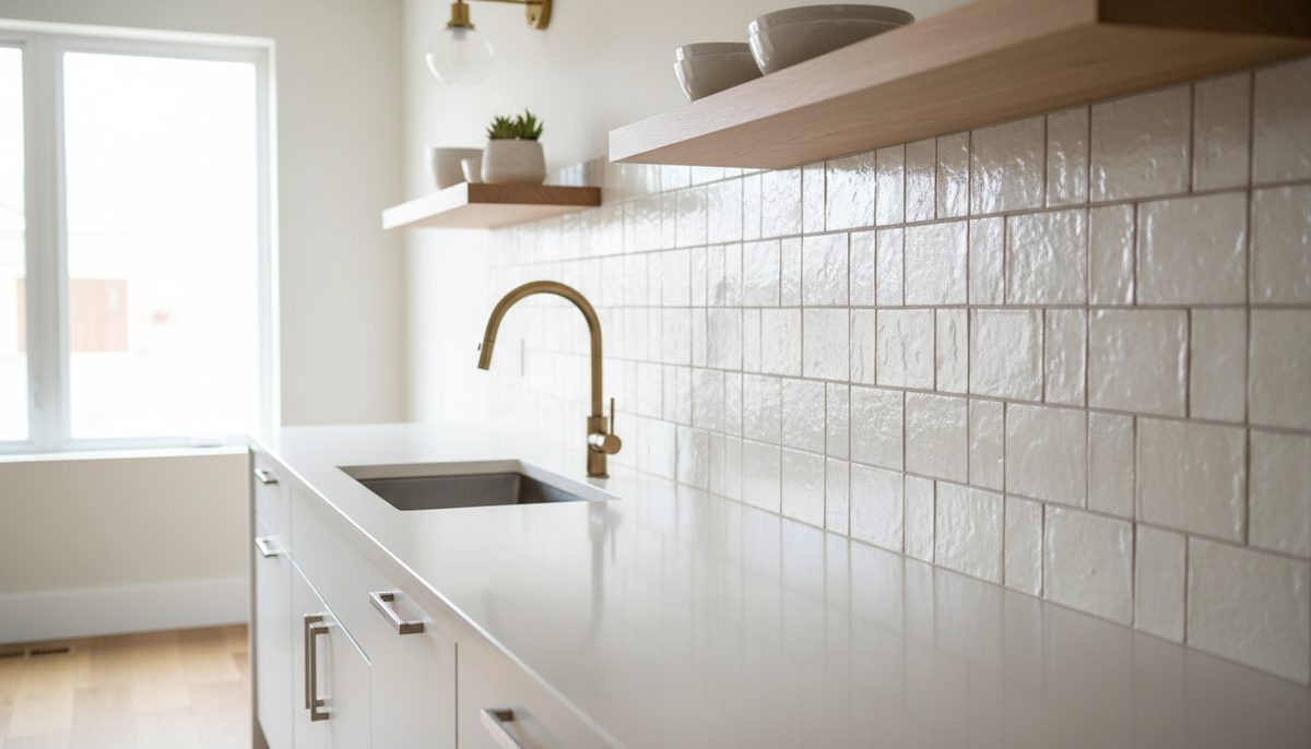
Two kitchens can use the identical tile and only one of them looks built rather than applied. The difference is almost never the tile. It is how high the field runs, how the joint width and grout color were chosen, where the outlets landed, and how the last edge was terminated. Settle those four and the tile is the easy part.
Decide the height before you decide the tile
The gap between a countertop and the underside of the upper cabinets usually falls between 15 and 20 inches, with 18 inches the most common. That standard 18-inch band is the default, and it is fine, but it is not the only option and it is rarely the best one.
- Standard band to the underside of the uppers. The cheapest and most forgiving choice. Works when you want the cabinets and countertop to lead and the wall to stay quiet.
- Full height on the range wall only. Tile runs from the counter to the underside of the hood, or all the way to the ceiling if the hood is a chimney style. This gives the room a focal wall without tiling the whole kitchen, and it is the single most effective upgrade on this list.
- Full height everywhere. Tile to the ceiling on every wall, with the uppers sitting on top of the tile. Expensive, dramatic, and it demands a tile you will still like in ten years.
- Slab backsplash. The countertop material continues up the wall, either as a short return or the full height. No grout lines at all, which is why it reads so clean, and why it costs the most.
- The 4-inch ledge. A short strip of countertop material at the wall with painted drywall above. It dates a kitchen faster than almost anything else. If you have one, removing it and tiling the full band is a weekend project with a real payoff.
One height decision people get wrong: stopping the tile at the top of the window casing on a sink wall. Either run it to the underside of the uppers on both sides and die into the casing cleanly, or run it to the ceiling. A tile field that stops at a random height in mid-air looks unresolved.
The layout changes more than the tile does
Take a plain 3 by 6 inch white ceramic subway tile and you have at least six different looks depending on how it is set.
- Running bond, half offset. The default. Reads as background. Safe and slightly generic.
- Third offset. Each course steps over by a third instead of a half. More movement, still calm. For any tile longer than 15 inches, use a third rather than a half, because a half offset on a long tile puts the high point of one tile against the low point of its neighbor and every joint shows lippage.
- Stacked, horizontal. Grid joints, crisp and modern. Unforgiving: your walls have to be flat and your layout dead plumb, because the grid amplifies every error.
- Stacked, vertical. Tiles on end in a grid. Pushes the eye upward and makes an 18-inch band look taller than it is. Excellent in a kitchen with 8-foot ceilings.
- Vertical running bond. Tiles on end, offset. Reads as texture rather than as a pattern.
- Herringbone. 45-degree or 90-degree. Handsome, and it eats 15 to 20 percent in waste plus a lot of labor at the cut edges.
Beyond subway, the formats worth considering: chevron, which is mitered at the ends so the points align and costs more than herringbone; picket and arabesque shapes, which need a bullnose or a trim profile at every edge; hexagons in 2, 4 or 8 inch sizes; penny round mosaic, which is grout-heavy and best in small runs; basketweave; and large-format porcelain in 12 by 24 or bigger, which gives you a near-seamless field for a fraction of a stone slab.
Handmade-look tile is its own category. Zellige and similar glazed clay tiles have irregular edges, variable thickness and a glaze that pools and shifts. They are the one tile that looks better with imperfect walls, because the surface is already irregular. They also take longer to set and demand a grout that will fill uneven joints.
Material families and where each one fails
Ceramic and porcelain. The workhorses. Porcelain is denser and better for a floor, but on a wall either is fine. Cheap, huge selection, easy to clean, no sealing.
Glass. Bright, reflective, good in a dark kitchen with one window. It has to be set in white thinset, because whatever is behind it shows through. Glass mosaic sheets on a large field can look busy and show the mesh grid pattern if the sheets are not staggered.
Natural stone. Marble backsplashes photograph beautifully and live badly next to a cooktop. Marble etches from lemon juice, vinegar and tomato, and grease drives into the stone. Behind a range, choose a honed quartzite, a soapstone, or a porcelain that imitates marble. If you use real marble, seal it and accept that it will patina.
Quartz or countertop slab. Continuous with the counter, no joints to clean, waterproof. Templated and installed by the fabricator, so it is not a DIY option. This is the answer for anyone who hates grout.
Stainless steel. Behind a range, in a panel, it is genuinely practical: heatproof, wipes clean, and it ties to the appliances. It also shows every fingerprint and scratches into a permanent haze if scoured.
PVC and 3D wall panels. Large sheets that go up with adhesive and cut with a utility knife, with no grout to seal. They are the fastest full-height coverage available and they handle steam near a sink well. Keep them away from direct heat above a cooktop and check the manufacturer temperature limit before you plan a range wall around them.
Peel-and-stick vinyl tile. Renter and budget territory. The 3D printed versions with a shadowed grout line are convincing from four feet and obvious from one. Best behind a sink or a coffee station, not behind a gas burner.
Grout is a design decision, not a leftover
Two variables: joint width and color.
Rectified tile, with mechanically ground edges, can go down at a 1/16 inch joint and produces a nearly continuous surface. Standard pressed tile needs 1/8 inch to absorb the size variation between pieces. Handmade tile usually wants 1/16 to 1/8 with a sanded grout that packs into irregular edges. Do not force a rectified-tile joint width onto a pressed tile; the layout will drift and you will end up with a tapered joint at the end of every run.
Color does the heavy lifting. Grout that matches the tile makes the field read as one surface, which is what you want when the tile itself is the interest, as with zellige or a marble-look porcelain. Grout that contrasts turns the layout into the pattern, which is what makes a plain white subway in a dark grout look intentional. A middle-gray grout with white tile is the compromise that hides dirt without shouting.
Epoxy grout costs more, sets fast, is harder to work with, and never needs sealing. Behind a range, that is worth the trouble. Cement grout is easier and cheaper and needs a penetrating sealer, reapplied roughly once a year in the grease zone.
One rule that separates professional work from amateur work: the joint where tile meets the countertop, and every inside corner, gets flexible caulk in a matching color, not grout. Those are movement joints. Grout them and they crack within a year.
Build the range wall as the focal point
The cooktop wall is where a backsplash earns its budget, because it is the one stretch of wall you see from the whole room instead of through a row of upper cabinets.
Options that work: a full-height field of the same tile as the rest, so the pattern is uninterrupted from counter to hood; a framed inset panel of a contrasting tile, bordered with a pencil trim or a metal profile, sized to the width of the hood rather than the width of the range; a slab of the counter material carried up behind the range only; or a shallow ledge, two to three inches deep, set 12 to 15 inches above the counter to hold oil and salt.
Size the focal panel to the hood, and center everything on the range, not on the wall. If the range is not centered under the hood, fix that first. A tiled panel centered on the wrong axis is visible from across the room forever.
Outlets, edges and terminations
These details are what people mean when they say a kitchen looks professionally done.
Countertop receptacles have to be GFCI protected and spaced along the run per current code, so plan them with your electrician rather than around the tile. What you can control is how they read. Turning the boxes horizontal lowers their visual weight. Better still, move power to under-cabinet outlet strips or into the underside of the uppers so the tile field is unbroken. If the outlets stay in the wall, try to land the box edges on grout lines, and pick plate colors that match the tile rather than defaulting to white.
Adding tile pushes the box back relative to the finished surface, so the boxes need extension rings. Skipping them leaves the device floating behind the plate, which is both sloppy and a code issue.
Terminations matter as much. Where a tile field ends on an open wall, finish it with a metal edge profile in a color that suits the tile, a bullnose piece if the line offers one, or a mitered outside corner if your installer is good. A raw cut edge with a bead of caulk is the single most common giveaway of a rushed job. Where a field ends at a window, run the tile into the jamb and return it, or stop cleanly at the casing. Pick one and repeat it at every window.
Coordinating with counters and cabinets
The rule that keeps kitchen designs with backsplash choices from going wrong: only one surface gets to be busy. A granite or heavily veined quartzite counter needs a quiet backsplash, which usually means a solid-color tile with matched grout. A plain white or solid quartz counter gives you room for pattern, texture, deep color or an unusual shape.
Undertone matters more than color name. Warm white cabinets against a cool white tile look dirty, and the mismatch only shows up after installation. Get a sample of the actual tile, set it on the actual countertop, next to the actual cabinet door, in the actual kitchen light. Do not judge from a store display.
With dark or deeply colored cabinets, a light backsplash creates the contrast that keeps the room from closing in. With white or light wood cabinets, a mid-tone or saturated tile adds the weight the room is missing.
Under-cabinet lighting will expose your tile work
An LED strip mounted at the front of the upper cabinet washes light down the wall at a shallow angle, and grazing light of that kind reveals every high corner and every uneven joint. On a handmade tile that is the point, since the shadows are the character. On a flat, machine-made tile set on a wavy wall, it is merciless.
Two responses. Mount the strip toward the front edge of the cabinet, not against the wall, so the light drops rather than rakes. And check the wall for flatness before tiling: hold a 4-foot level against it, and skim or shim anything over 1/8 inch of deviation. Also mind the light color. A 3000K strip over warm-toned tile keeps the color you chose; a 5000K strip drains it.
Quantities, waste and what actually drives the cost
Measure each run in feet of length by the height in feet, add them up, and subtract windows. A standard 18-inch band over 20 linear feet of counter is 1.5 times 20, or 30 square feet. Running that same wall full height at 4.5 feet gives 90 square feet, which is why full height is a different budget conversation.
Add 10 percent waste for a stacked or running bond layout, 15 to 20 percent for herringbone, chevron or anything set on the diagonal. Order it all in one shipment and confirm the lot numbers match; shade varies between production runs and the difference lands right in the middle of your wall.
Cost is driven by labor far more than by the tile. Small mosaics, complex patterns, and a lot of edge and outlet cuts multiply hours. A large-format porcelain in a simple grid can be cheaper installed than a bargain mosaic that takes three days to set.
Mistakes worth avoiding
- Choosing the tile before the countertop. The counter has less flexibility, so pick it first and let the tile follow.
- A 4-inch ledge of counter material with painted wall above.
- Mosaic sheets installed without staggering, so the mesh grid shows as a faint repeating rectangle across the field.
- Grout, not caulk, in the counter joint and the inside corners.
- Unsealed cement grout behind a gas range. Grease will darken it in a season.
- Real marble at the cooktop.
- Centering the focal panel on the wall instead of on the range.
- Ending the tile with a raw cut edge because nobody ordered trim.