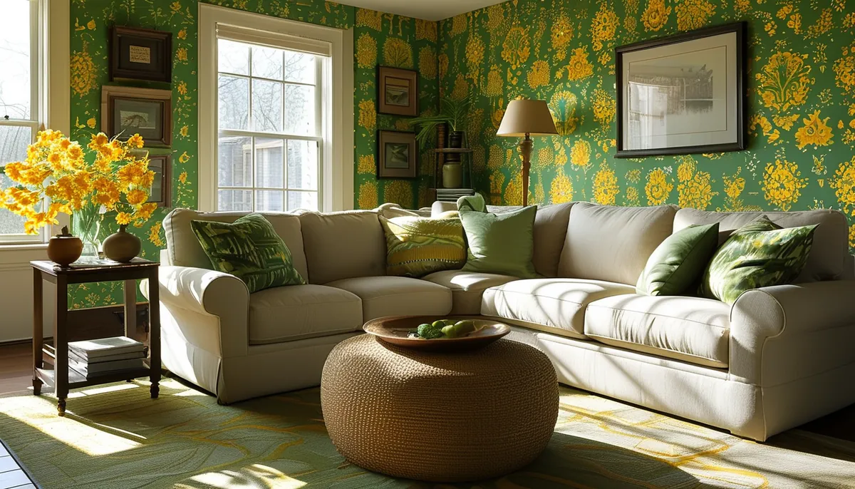
Green and yellow are neighbors on the color wheel, which is why the combination has almost no middle ground. Handled with a clear dominant and a small accent it reads like a garden. Split near 50-50 at full saturation it reads like signage. The ratio, not the shade, is what separates the two outcomes.
Decide which color leads before you look at patterns
Pick one to carry roughly 70 percent of the visible surface and let the other take 20 to 25 percent, with the remainder going to a neutral ground: cream, oat, warm white, soft charcoal. Green leading with yellow accents is the calmer of the two and works in bedrooms and living rooms because green is the lower-energy color at equal saturation. Yellow leading with green accents is high-stimulation and belongs in rooms you pass through or use in short bursts: an entryway, a powder room, a laundry, a breakfast nook.
Look at the pattern squinting, or at a photo shrunk to thumbnail size. That is what your eye does from across a room. If both colors survive the squint at the same weight, the wall will feel restless. One of them should recede.
The ground color matters more than most people expect. The same botanical print on a cream ground and on a white ground are different products in a room. White grounds make yellow look acidic and green look synthetic, because pure white has no warmth to absorb the yellow. A cream or bone ground softens both.
Undertone is the thing that actually clashes
Greens divide into yellow-based (olive, sage, moss, chartreuse) and blue-based (emerald, forest, teal-green, viridian). Yellows divide into warm (mustard, ochre, amber, honey) and cool (lemon, butter, primrose).
Warm yellow with yellow-based green is the safest pairing. Both sit in the same half of the wheel and read as one family, which is why sage-and-ochre prints work in almost any room. Cool yellow with blue-based green is also coherent, but it is sharp and modern and needs restraint: think a single lemon accent in an emerald print, not stripes.
The failure is crossing the streams. Cool lemon against warm olive looks dirty, because the olive’s yellow base is muddied by a brighter, bluer yellow sitting next to it. Emerald with mustard is the other bad pair; the green pushes the mustard toward brown. If you cannot tell which category a color is in, hold the sample next to a plain sheet of copy paper. Copy paper is bright cool white and it exposes the warmth or coolness of everything beside it.
Room orientation changes both colors, not just one
North-facing rooms in most of the US get cool, indirect light that never turns warm. Yellow holds up there better than green does, and a warm ochre can be the thing that rescues a room that always felt gray. Blue-based greens in north light go flat and slightly gray by mid-afternoon.
South-facing rooms get warm, strong light for most of the day. That light adds yellow to everything, so a yellow-dominant paper can tip into glare. Let green lead in those rooms and keep the yellow to accents.
West-facing rooms take direct orange light for the last two hours of daylight, which is when yellow-green prints go orange-green. If the room is used mostly in the evening, judge the sample at 6 p.m., not at noon.
East-facing rooms are warm in the morning and cool the rest of the day, so they take the widest range. That is why breakfast rooms are a common home for the brightest version of this pairing.
Bulbs finish the job. A 2700K lamp deepens ochre and pushes sage toward brown. A 4000K lamp keeps green crisp and makes warm yellows look chalky. Tape a full sheet of the sample to the wall, leave it three days, and look at it in daylight and under your own lamps before ordering.
Pattern types and where each one belongs
Botanical and large-scale florals are the traditional home for green and yellow, and they give you the ratio for free: green foliage as the field, yellow blooms as the accent. Check the repeat size. A 25-inch repeat on an 8-foot wall shows the motif three and a half times, which reads as a designed wall. The same repeat in a 3-foot-wide powder room shows one and a half motifs and reads as a fragment.
Geometrics split the two colors evenly by construction, which is why they are the riskiest choice here. If you want a geometric, look for one where the yellow appears as a thin line or a small shape rather than a full block.
Textural papers, meaning grasscloth looks and fine linear weaves, let you get away with more saturation because the texture breaks the color into thousands of small variations. A moss grasscloth with a yellow warp reads as a single complex color from 8 feet away.
Small-scale prints, under about a 4-inch repeat, turn into a solid from across the room. Choose those for the color they average to, not the motif you see holding the sample at 12 inches.
What goes with it: trim, ceiling and floor
Bright white trim against a warm green and yellow print is the default and it is usually wrong. Pure white cuts the wall off with a hard cold line. A warm white or a soft off-white with a yellow base keeps the baseboard and casing from fighting the paper. In a room with a strong yellow lead, painting the trim a deeper tone pulled from the print’s darkest green is a stronger move than white at all.
For the ceiling, sample the palest color inside the print and go two or three steps lighter. A ceiling in a very pale version of the paper’s cream ground makes an 8-foot ceiling feel taller than flat white does, because the eye stops registering the boundary.
Floors matter because they add a fourth color. Warm oak and honey-toned vinyl plank reinforce the yellow and can tip the room over; if the paper is yellow-dominant, a mid-brown or gray-brown floor calms it. Cool gray floors under a yellow-based green make the green look dull. Bring a plank sample and the wallpaper sample together in the actual room, on the actual floor, before deciding.
Add one non-green, non-yellow element to keep the scheme from looking like a color exercise. Terracotta, rust, black metal, unbleached linen, or plain rattan all do this. A single black picture frame or a matte black switch plate reads as intentional restraint.
Where to use it and where to stop
One wall is the low-risk version, and it works best on the wall you face when you enter, not the wall behind you. Four walls of a saturated green-and-yellow print works in a small room used briefly, like a powder room measuring 4 by 5 feet, where committing fully is more convincing than a single accent panel would be.
Below a chair rail, at roughly 32 to 36 inches, is worth considering in a dining room: the print sits under eye level, the top two-thirds stay quiet, and the pairing stops competing with food and table settings.
Kitchens are workable away from the range and sink, using a vinyl or vinyl-coated paper that takes a damp cloth. Keep it off the wall directly behind a cooktop, where grease and heat will end the experiment inside a year.
Skip the pairing in a home office where you take video calls. Saturated yellow bounces onto skin on camera and no white balance setting fixes it convincingly. That room wants the green alone, in a muted sage, with the yellow relegated to something you can move out of frame.