Retro upholstery is two separate problems wearing one name. The first is visual: matching a fabric to a frame and a decade so the result reads as intentional rather than as a thrift-store accident. The second is technical: the fabric has to survive being sat on, and period-authentic weaves vary enormously in how well they do that. Solve one and ignore the other and you get a chair that either looks wrong or wears out in two years.
Reading the frame before you shop for fabric
The frame tells you which decade the piece belongs to, and it constrains what will actually upholster well.
Mid-century, roughly 1945 to 1965. Exposed wood legs, often tapered and splayed. Thin arms, low backs, tight or lightly padded cushions, compact proportions. These frames have tight curves and shallow padding, which means the fabric needs to be relatively thin and flexible enough to pull around a corner without bulking. Heavy chenille or a stiff jacquard fights a mid-century frame at every staple.
Late sixties and seventies. Lower, wider, and softer. Rounded arms, deep seats, plinth bases rather than legs, sometimes a full skirt. These frames have generous flat planes and can carry heavier cloth, big patterns, and pile fabrics without looking overstuffed.
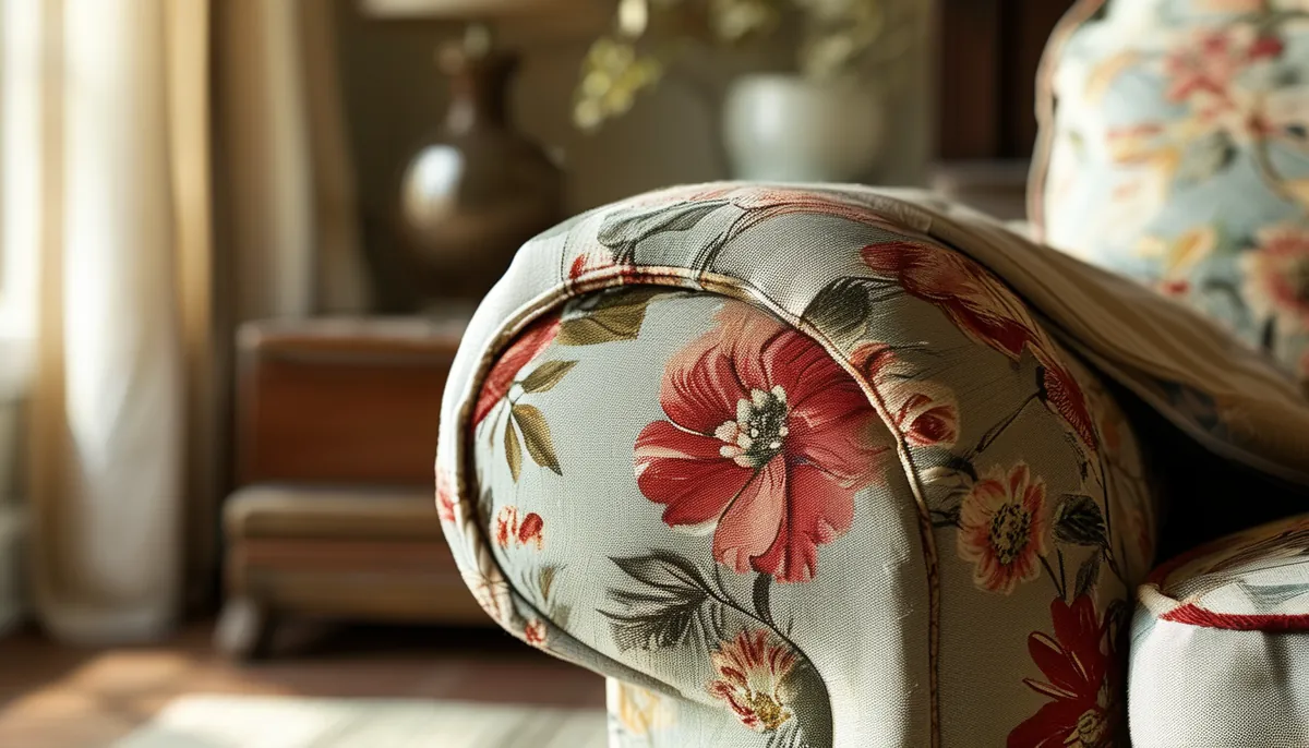
Eighties. Overstuffed rolled arms, deep cushions, and a lot of surface area. The visual load is enormous, which is why the period ran to florals and chintz. Reupholstering one of these in a bold retro print is a commitment, since the pattern will occupy an entire wall of the room.
A useful rule: the smaller and more sculptural the frame, the more the fabric should behave like a solid or a small-scale texture. Big patterns need big flat surfaces or they get chopped into fragments by seams and welting.
The fabrics that define each era
Wool tweed and boucle. The signature mid-century upholstery, and still the most practical retro choice. A tight wool tweed with a nubby surface hides wear, resists pilling if the yarn is properly spun, and has natural flame resistance and moisture regulation. Boucle, with its looped surface, is softer and reads more residential, but the loops can snag on pet claws. Check the loop density: tightly packed loops on a stable backing survive; loose loops on a thin ground do not.
Flat-weave wool and wool blends. The plain, slightly heathered wool used on Scandinavian frames. Extremely durable, ages well, and the heathering hides soil. It is the safest choice for a piece that gets daily use.
Velvet. Seventies velvet was usually cotton or rayon with a substantial pile. Modern performance velvets in polyester give a similar look with far better cleanability and resistance to crushing. Pile direction matters: velvet has a nap, and every piece of a chair has to be cut running the same way or the panels will read as different colors under the same light.
Geometric jacquards and woven patterns. The woven-in pattern of a jacquard has depth a print cannot match, and it wears better because the pattern is structural rather than surface-applied. This is where seventies orange, avocado, and harvest gold geometrics live, and where the risk of looking like a costume is highest. One jacquard piece in a room reads as a deliberate vintage note; three read as a period set.
Barkcloth. Nubby cotton with a slightly crinkled hand, printed with the tropical and atomic patterns of the forties and fifties. Authentic vintage barkcloth is often too fragile for seating. Reproduction versions on a heavier ground exist and are the sane choice for anything that gets sat on. Vintage yardage belongs on pillows, valances, or a chair back that nobody leans against.
Vinyl and faux leather. Deeply period-correct for diner booths, sixties dining chairs, and anything meant to look commercial. Modern polyurethane faux leather is softer and more breathable than the vinyl of the era, and it cleans instantly, which is why it is still the right call in a kitchen or a household with children. The failure mode to check for is delamination: cheap versions crack and flake at stress points within a few years.
Durability numbers that actually predict wear
Abrasion resistance is measured with a machine that rubs a fabric until it fails, and the result is reported in double rubs. Two test methods are in use and they are not interchangeable.
The Wyzenbeek method is standard in the US and reports double rubs directly. Rough guidance: under 9,000 is decorative or light duty, 9,000 to 15,000 is general residential, 15,000 to 30,000 is heavy residential, and above 30,000 is contract grade. A sofa the family uses every evening wants at least 15,000. A guest room chair can live at 9,000.
The Martindale method is the European standard and reports a different unit on a different scale. Comparing a Martindale number directly against a Wyzenbeek number is meaningless, and any seller who converts between them with a simple multiplier is guessing.
Two other numbers appear on a good data sheet. Pilling resistance is graded on a scale where higher is better and matters most for wool blends and anything with a loose surface. Lightfastness matters if the piece sits near a window, and it is the reason many bright retro colors from the era faded to pastels within a decade.
Beware of chasing high double rubs at the expense of everything else. A very high abrasion number on a coarse, stiff cloth can mean a fabric that is uncomfortable to sit on and impossible to pull around a curve. Match the number to the use and then judge the hand.
Cleaning codes, and why they change what you can buy
Every legitimate upholstery fabric carries a cleaning code, usually printed on the sample tag.
- W means water-based cleaners are safe. The most forgiving code and the one to look for in a house with children or pets.
- S means solvent cleaning only. Water will leave rings. Common on rayon, some velvets, and many silk blends.
- WS means either method works. The best case.
- X means vacuum and brush only, no liquid at all. Any spill is a professional job or a permanent mark.
Authentic vintage yardage often has no code at all, which means testing on a hidden scrap before anything touches the piece. If you cannot test, treat it as X.
Railroaded or up the roll, and the yardage math
Upholstery fabric comes in two orientations and confusing them costs money.
Up the roll means the pattern runs vertically along the length of the fabric, the way a bolt of dress fabric works. Most fabrics are this way. On a wide sofa, an up-the-roll fabric has to be seamed to cover the back and the seat, because the roll is typically 54 inches wide and the sofa is not.
Railroaded means the pattern runs sideways along the roll, so a single continuous piece can be pulled across a wide sofa with no seam. Solid textures are frequently railroaded, and for a long piece it is the difference between a clean back and a seam down the middle.
Repeat is the other multiplier. A pattern with a 27-inch vertical repeat forces every cut piece to start at the same point in the pattern, and the offcuts between usable pieces are waste. A rough planning approach: for a repeat under 4 inches add roughly 10 percent to your yardage, for a 14-inch repeat add around 20 percent, and for a repeat over 24 inches add 25 to 30 percent. A half-drop match, where alternating columns are offset, adds more still.
Get the yardage estimate from whoever is doing the work, and get it before you buy. Upholsterers estimate from the actual frame, and a chair that a chart says takes 5 yards can take 7 once you account for a pattern that has to be centered on the back, the seat, and each arm panel.
Buy the whole quantity in one order so it comes from a single dye lot. Retro colors in particular vary noticeably between lots, and a chair with one arm from a different lot is a chair you will notice for the rest of its life.
Making retro read as design rather than costume
The most common mistake is period matching everything. A mid-century frame in a period-correct tweed, next to a period-correct teak table, on a period-correct rug, in a room with period-correct wall paneling, stops being a home and starts being a set.
The version that works uses one strong period element and lets the rest of the room be quiet. A single seventies geometric jacquard armchair against plain walls and a modern sofa reads as a considered choice. Scale the pattern to the piece rather than to your enthusiasm: a large-scale repeat needs a large flat area, and on a small chair the eye only sees a fragment.
Color is where authenticity and livability diverge. The actual palette of the era included colors most people no longer want on a large piece. Pulling one period color into a smaller dose, on a pair of throw pillows or a single chair, gets the reference across without committing a sofa to harvest gold.
Finally, check the piece under the light it will live in. Retro fabrics were designed under incandescent light, and many of the era’s greens and golds go flat and slightly sour under cool LED bulbs. Take the sample home, put it on the actual frame, and look at it at night. That is a free test and it prevents the most expensive kind of regret, which is discovering the problem after eight yards have been cut.