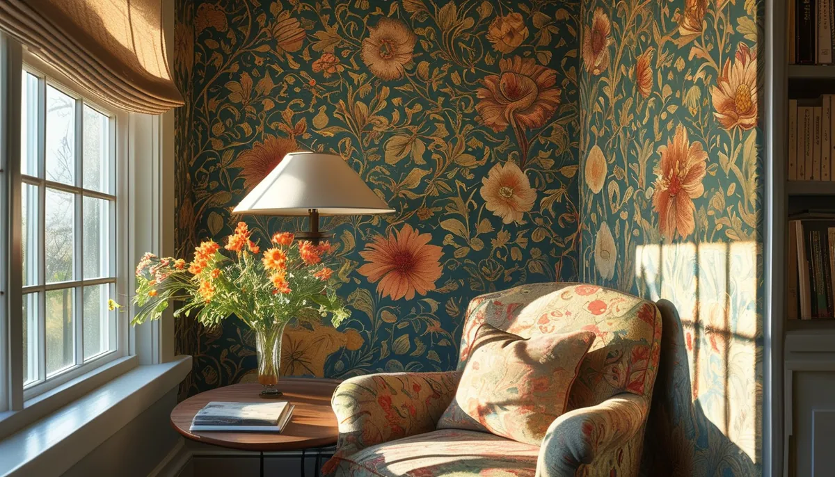
Morris designs date from the 1860s through the 1890s, and nearly everything on the market today is a reproduction of a hand block-printed original. That history matters in a practical way. The drawings were made for rooms with 10-foot ceilings, dark woodwork and low, warm light, and the colors were mixed as distemper rather than printed digitally. A faithful reproduction can be perfectly accurate in line and still land badly on a 96-inch wall lit by six recessed cans.
Match the pattern scale to the wall you actually have
Morris designs sort into three practical scale groups, and the group matters more than the name.
- Tight, small-motif repeats. Daisy, issued in 1864 and generally credited as the first Morris paper to reach the public, along with Marigold and Willow Bough from 1887. From eight feet away these read as texture, not as a picture. They behave like a wall finish.
- Mid-scale florals. Strawberry Thief from 1883, Pimpernel from 1876, Blackthorn. You can identify individual birds and blossoms across a room. These need a wall wide enough to show the drawing repeating, or the eye reads it as a single confused smear.
- Large sweeping foliage. Acanthus from 1875, Chrysanthemum from 1877, Golden Lily. A single motif can run most of the height of a powder room wall.
The working rule: you want at least three full repeats visible across the widest uninterrupted stretch of wall, and at least two from floor to ceiling. Put a large-scale acanthus on a 42-inch-wide powder room wall and you get one and a half leaves. It looks like a mistake rather than a pattern. Take the same paper into a stair hall with a 14-foot run of wall and it finally makes sense.
Read the repeat before you look at the price
Two numbers on the spec sheet decide how much you spend: the vertical repeat and the match type. A straight match lines the pattern up at the same height on every strip. A half-drop match steps the next strip down by half a repeat, which is common on Morris florals because it hides the grid of the original printing blocks. A half-drop costs you more paper.
Calculate the cut length first: wall height, plus one full vertical repeat, plus four inches of trim allowance at top and bottom. Then divide the roll length by that cut length and round down. Whatever is left over is scrap unless you have a short wall over a doorway.
Run the math on a real wall. Ceiling at nine feet, so 108 inches. A 21-inch repeat. Cut length is 108 plus 21 plus 4, which is 133 inches. On a European roll of roughly 20.5 inches wide by 33 feet long, that is 396 inches of paper, which yields two usable strips and 130 inches of waste, agonizingly short of a third strip. Two strips cover 41 inches of wall. A 10-foot wall needs six strips, so three rolls, for 120 inches of finished wall. American rolls run wider, around 27 inches, and are usually sold as double rolls of about 27 feet. Check which format you are buying, because the coverage per roll is similar even though the dimensions are not.
Order every roll in one purchase and check that the batch or run number matches on each label. Dye lots shift, and a Morris ground color in indigo or olive shows a shift badly at a seam.
The colorway changes the room more than the drawing does
The same Strawberry Thief in an indigo ground and in a cream ground are two different products in a room. Dark grounds swallow light. In a north-facing bedroom with one window, an indigo or charcoal ground drops the apparent brightness enough that you will want to add a lamp. That can be exactly what you want in a dining room used at night, and exactly wrong in a home office you sit in at 9 a.m.
Olive and gold grounds are the trickiest, because they pick up whatever is on the floor. Over a red-toned oak or a warm LVP they go muddy. Over a gray-washed floor they read clean. Tape a sample to the wall, leave it for two days, and look at it in morning light, under your actual bulbs at night, and with the lamp off. A 2700K bulb will warm a sage ground noticeably; a 4000K bulb will make it look gray and cold.
Peel-and-stick or traditional paste for a pattern this dense
Peel-and-stick vinyl is the right answer for renters, for a half bath you may redo in three years, and for anyone who has never hung paper. The tradeoff is at the seams. The material has some give, so on a half-drop match with a busy floral you can stretch a strip slightly while positioning it and end up with a pattern that walks a sixteenth of an inch off across three strips. On a tight repeat like Willow Bough nobody sees it. On Pimpernel everybody does.
Non-woven paste-the-wall paper is dimensionally stable, does not expand while it soaks, and holds a half-drop match honestly. It is the better choice for a large-scale pattern and for a whole room rather than one wall. It needs a primed, sound surface underneath.
Either way, wall texture defeats the pattern. Orange peel and knockdown finishes telegraph through, and the raised bumps catch light along every seam. Skim coat the wall smooth or hang a liner paper first. This is the step people skip and the reason most disappointing jobs look disappointing.
Where a Morris pattern earns its keep
Small rooms you pass through, or sit in without staring at the walls, take these designs best: powder rooms, a stair hall, an entry, the ceiling of a tiny bath. In a dining room, paper above a chair rail set at 32 to 36 inches and paint below gives the pattern a defined field instead of letting it flood the room. Behind a headboard, run it wall to wall rather than stopping at the bed width, and hang art at least eight inches above the headboard so it does not fight the drawing.
It fights back in open-plan great rooms where five doorways chop the field into fragments, and in kitchens where upper cabinets slice the pattern at random heights. If a wall has more openings than solid area, choose a small-motif design or skip paper entirely.
Trim, molding and paint that hold the pattern down
Pull the darkest tone out of the paper for the trim and doors, and something near the lightest tone for the ceiling. Matching the trim to the paper ground, rather than defaulting to bright white, is what makes these papers look intentional instead of applied. For a nine-foot ceiling, baseboard in the five to seven inch range keeps the proportions right against a tall pattern.
Picture frame molding below a chair rail, painted out in one color, gives a busy paper above something quiet to sit on. Leave four to six inches between the molding boxes and the rail, and keep the boxes proportional to the wall segment rather than all the same width.
Hanging it: the details that decide the result
Snap a plumb line half an inch narrower than the paper width from your starting corner, because no wall is plumb and the pattern will show it instantly. Start in the least visible corner, since the last seam is where the pattern will never match, and you want that in a corner behind a door.
Do not wrap more than half an inch of paper around an inside corner. Cut, overlap, and start a fresh plumb line on the new wall. Smooth from the center of each strip outward with a plastic smoother, and go easy with the seam roller on dark grounds, which burnish to a shine if you lean on them. Change your blade every two or three cuts at the baseboard; a dull blade tears the face paper and the tear shows.
Living with it
Vinyl-coated reproductions wipe down with a damp sponge and mild soap. Uncoated papers do not, so keep them out of a bathroom without a working exhaust fan, and run the fan for 20 minutes after a shower. Steam lifts seams from the top down, and a lifted seam on a dark ground shows a white edge you cannot hide. Keep two feet of leftover paper flat in a closet, not rolled in a garage, for the day something gouges the wall.