Tile decisions get made in showrooms and paid for in bathrooms. The sample board is lit from above at 4 feet; your bathroom is 5 by 8 feet with one fixture and a mirror bouncing light sideways. Below are the design directions that hold up in a real American bathroom, with the sizes, joint widths, and specs that decide whether the idea survives contact with a wet room.
Start with the specs that limit the design
Three numbers narrow the field before aesthetics enter:
- Slip resistance. For a wet bathroom floor, look for a dynamic coefficient of friction of at least 0.42 under the ANSI A137.1 test. Polished porcelain and polished marble come in well under that. If you want a polished look on the floor, get it in a smaller format with more grout lines, because grout joints do the work the surface will not.
- Water absorption. Porcelain absorbs 0.5 percent or less by weight. Ceramic absorbs more and is fine on walls, questionable on a shower floor, and a bad idea in an unheated bathroom in a cold state.
- Substrate flatness. Large tile demands a flat wall or floor. A common tolerance for tile 15 inches or longer is 1/8 inch of deviation in 10 feet. Most builder drywall is not there, and no amount of thinset fixes it.
Grout joint width follows tile edge type. Rectified tile, cut square after firing, can run 1/16 to 1/8 inch. Pressed tile with a soft edge needs 1/8 to 3/16 inch, and forcing it tighter puts every size variation right in your sightline.
Backsplash: the smallest tile decision with the biggest reach
A vanity backsplash has three common heights and they read completely differently.
4-inch. The builder default, usually a cut strip of the countertop material. Functional, invisible, and it dates a bathroom faster than anything else on this list.
18 to 20 inches. Up to the underside of the mirror. This is the sweet spot in most bathrooms: it protects the wall where water actually lands, it gives you a place to use an expensive tile in a quantity you can afford, and it frames the vanity.
Full height to the ceiling. Strong in a powder room with a single vanity wall. In a full bathroom it competes with the shower and you end up with two feature walls arguing.
Run the backsplash 2 to 4 inches wider than the vanity on each side, or take it wall to wall. Stopping it flush with the cabinet edge draws a vertical line that emphasizes exactly how narrow the vanity is.
Mixed media without a clash
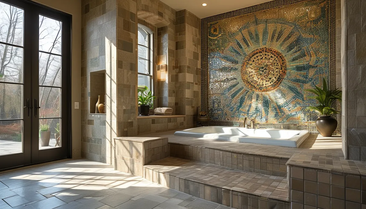
Combining materials is where most bathrooms go sideways. The rule that works: two tile shapes and one accent, maximum, in a room under 60 square feet.
Practical combinations:
- 3 by 6 subway on the shower walls, 2 by 2 mosaic on the shower floor, 12 by 24 on the main floor. Three formats, one color family, no argument.
- Wood-look vinyl plank on the floor with porcelain in the wet zone. The plank keeps the room warm underfoot and the tile takes the water.
- A stone or terrazzo countertop with a plain porcelain wall. Let one surface carry the visual weight.
Keep the grout color consistent across formats. Two grout colors in a small bathroom cuts the room into pieces. Where two materials meet in a corner or at a floor transition, use a metal trim profile rather than a caulk joint. Caulk yellows, shrinks, and shows every mistake behind it.
Large-scale terrazzo and other big-pattern tile
Terrazzo in a 24 by 24 or 24 by 48 format is a strong look and an unforgiving install. The aggregate scale is designed to be read across a whole floor, so in a 5 by 8 bathroom you will see three or four tiles total and each one has to be a good piece of the pattern.
What to check before you commit:
- Lay out the full floor dry, or at least photograph every tile face, and reject the ones where the aggregate clumps.
- Plan cuts so the toilet flange and the vanity toe kick do not eat the best tile.
- Back-butter every large tile and use leveling clips. On a 24-inch tile, 1/32 inch of lippage catches a bare toe and shows under raking light from a window.
- A large-format tile floor is heavier. On a second-floor bathroom with 2×8 joists at 16 inches on center, confirm the deflection is within spec before adding a mud bed.
The cheaper version of the same idea: a small-aggregate terrazzo-look porcelain in 12 by 24. Less drama, far more forgiving in a small room.
Kit kat tiles and other finger mosaics
Kit kat tile, also sold as finger mosaic or stick mosaic, is a thin rectangular tile roughly 1/2 to 1 inch wide by 4 to 6 inches long, delivered on 12 by 12 inch mesh sheets. It is having a long moment and it comes with a maintenance bill.
Do the math before you love it. A square foot of 3 by 6 subway has about 4 linear feet of grout joint. A square foot of finger mosaic has three to four times that. Every one of those joints is a place for soap film in a shower and for mold in a bathroom without a working exhaust fan.
Where it works: a shower niche, a 12- to 18-inch vertical feature band, a powder room accent wall, a vanity backsplash. Where it costs you: a full shower surround you have to squeegee.
Use epoxy or a high-performance cement grout in the wet zone. Standard sanded grout in that many joints will discolor unevenly within two years. And check the sheet layout as you set: mesh-mounted sheets telegraph their seams if you do not stagger and align the edge sticks by hand.
Faux marble that does not read as faux
Porcelain marble-look has gotten good enough that the giveaway is no longer the print quality. It is repetition. Inkjet porcelain is printed from a limited set of face patterns, sometimes as few as six, and in a small bathroom you will notice the same vein turning up every third tile.
What to ask and check:
- How many unique faces are in the run? More than 20 is good, fewer than 10 shows.
- Is the veining through-body or surface only? Through-body means a chipped edge or a mitered corner still looks like stone.
- Does the line offer a book-matched pair? Two mirrored slabs behind a freestanding tub is the single most convincing use of the material.
Mix tiles from at least three cartons as you set, the way you would with natural stone. Setting carton by carton is what creates the visible repeat.
Real marble in a bathroom is a different commitment: it etches from anything acidic, including some common cleaners, and it needs sealing on a schedule. That is a fair trade in a powder room used twice a week. It is a bad trade in a kids’ bathroom.
Botanicals and patterned floors
Patterned encaustic-look porcelain reads best where you can see the whole field at once, which in most homes is a small bathroom floor. A 5 by 8 bathroom has roughly 40 square feet of floor, minus the tub and vanity footprint, so you are really looking at 20 to 25 visible square feet. A motif that repeats every 8 inches fills that beautifully. A motif that repeats every 24 inches gives you two and a half repeats and looks like leftover material.
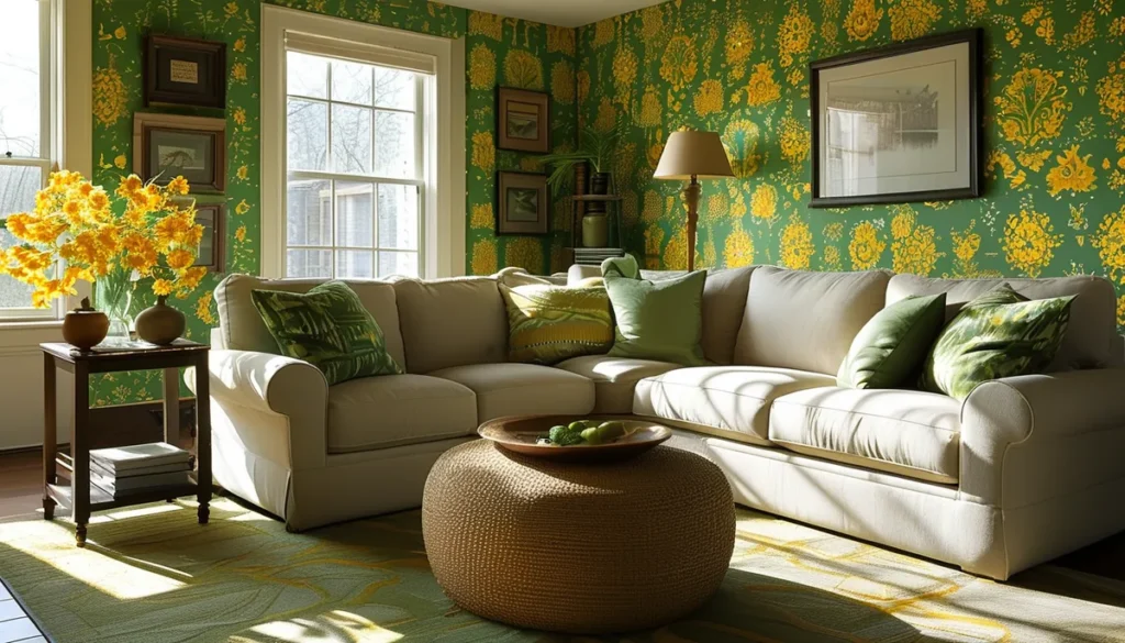
Botanical wall patterns work on a different logic. A leaf or palm motif behind a vanity is a graphic element and it wants space around it, so keep the surrounding tile plain and light. If you want a botanical without the tile commitment, a bathroom-rated peel-and-stick vinyl outside the direct splash zone gets you there and comes off later.
One pattern per bathroom. A patterned floor and a patterned wall in 40 square feet is not layering, it is noise.
Bohemian layers, and what actually makes them work
The bohemian bathroom depends on handmade variation rather than on more stuff. Zellige and other handmade-look tiles carry uneven edges, thickness variation of 1/16 inch or more, and a glaze that pools differently on every piece. That variation is the point, and it means:
- Wider grout joints, typically 1/8 to 3/16 inch, because the edges are not straight.
- A warm grout, sand or greige rather than bright white, so the joint recedes and the tile does the talking.
- More waste. Order 15 to 20 percent extra rather than the usual 10, because you will reject pieces.
Pair it with warm metals, wood-look flooring, and a single terracotta or unglazed element. Skip the polished chrome, which fights the matte glaze under every light temperature.
Matching versus contrasting
Running the same tile from floor to wall makes a small bathroom read larger, because the eye finds no horizontal break to measure the room against. It works best with a mid-tone tile and a matched grout, and it demands a flat substrate since there is no change in material to hide a wavy wall.
Matched grout hides layout errors. Contrasting grout advertises them: white subway with charcoal grout is a great look and it will show every 1/32 inch your spacing drifts. If it is your first tile job, match the grout.
Where contrast earns its keep is at the floor. A darker floor than the walls grounds the room and hides the dust and hair that a light floor displays daily. In a bathroom used by a household of four, that is not a style question.
Before you order
Buy 10 percent extra on straight lays, 15 percent on diagonals and herringbone, and 20 percent on handmade tile, all from the same batch number. Keep a full box after the job; discontinued tile is the reason small repairs turn into full retiles.
Confirm the waterproofing plan behind the shower tile before you pick anything, since a sheet or liquid membrane over cement board is what keeps the wall dry, not the tile. And tape three candidate samples to the actual bathroom wall for two days. Fluorescent showroom light and a north-facing bathroom at 7 a.m. are not the same room.