Blue is the one color family that changes character completely between daylight and lamplight, and a bedroom is the room you look at most under lamps. A blue that reads crisp and coastal at 2 p.m. under a south window can turn dull gray or faintly purple at 9 p.m. under 2700K bulbs. Any useful decision about blue bedroom wall colors starts with that fact, not with a mood board.
The five blues that actually get used in bedrooms
Paint decks contain hundreds of blues but they cluster into a handful of behaviors.
- Navy and near-black blue, typically with a light reflectance value between 5 and 15. Absorbs light aggressively, makes walls recede, and photographs beautifully. In a bedroom under 11 by 12 feet with one window, navy on all four walls will feel like a cave by January unless you compensate with lamp count.
- Slate and denim blue, LRV roughly 20 to 35. The most forgiving family. Enough gray in the mix that it stays quiet under both daylight and warm bulbs, and it does not fight wood furniture.
- Gray-blue, LRV around 40 to 55. Reads as a neutral in low light and only shows its blue in direct sun. Safe, and easy to make boring if nothing else in the room carries contrast.
- Powder and sky blue, LRV 65 and up. Fresh in a room with strong daylight, and prone to reading as a nursery if the trim and bedding are also pale.
- Teal and blue-green. Sits between blue and green and shifts depending on what is next to it. Beside warm wood it reads green; beside gray it reads blue. Powerful in a bedroom, but it demands that you commit to a temperature elsewhere in the room.
Undertone matters as much as depth. A blue with a red base drifts toward purple in lamplight, which is the single most common complaint about blue bedrooms. A blue with a green base holds its character under warm bulbs and is the safer buy if you cannot test properly.
Window direction changes the answer
North-facing bedrooms receive flat, cool indirect light for most of the day. That light emphasizes the blue and cools it further, so a gray-blue that looked balanced on a chip will look icy and slightly clinical on the wall. In a north room, pick a blue that is a step warmer than what you think you want: something with a green or a soft violet lean rather than a pure cool blue.
South-facing bedrooms get long hours of warm direct sun, which neutralizes cool tones. This is where deep navy and saturated slate perform best, because the sun keeps them from going flat, and where pale blues wash out to near-white by mid-afternoon.
East-facing bedrooms get bright warm light early and cool indirect light after noon. If you get up at 6 a.m., you are seeing this room at its warmest, and a blue chosen at that hour will look colder every other hour. West-facing bedrooms invert it: cool all morning, then an orange cast in late afternoon that can push a teal wall toward green.
Test with painted poster board rather than swatching the wall directly. Two coats on a 2-foot square, viewed at three times of day plus once with only the bedside lamps on. Move the board to the wall behind the bed, then to the wall opposite the window, then hold it flat against the floor. A blue that survives that is a blue that will not surprise you.
All four walls or just one
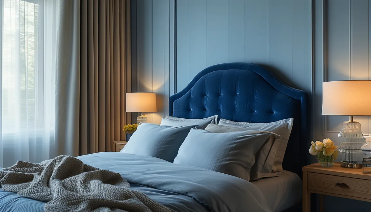
A single blue wall behind the headboard is the low-risk version and it works because it puts the darkest surface where you never sit facing it. It also lets you use a much deeper shade than you could tolerate on four walls: a near-black navy on one wall in a 12 by 12 bedroom reads dramatic, while the same color on four walls reads small.
Full-envelope blue, meaning walls plus ceiling plus trim in the same shade, is the other approach that reliably looks intentional. Because there is no contrast at the corners, the room loses its visible boundaries and can actually feel larger than a bedroom with a single dark wall and three light ones. It works best in small rooms and in rooms with limited daylight, which is the opposite of most advice. The requirement is layered lighting: bedside lamps, a fixture with a warm-toned shade, and ideally a wall light or two, because a dark room lit by one ceiling fixture is a dim room.
The version that usually fails is three light walls plus one blue wall on a surface broken by a closet door and a window. There is not enough uninterrupted field to carry the color, and the door casing chops the wall into pieces.
Bulbs, and why they matter more than the paint
Bedroom bulbs are usually 2700K, which is warm and slightly orange. Orange light on a cool blue wall desaturates it, and on a red-based blue it produces the purple shift. If you already own the fixtures, decide the paint after you know the bulb temperature. If you want a blue to stay true after dark, 3000K bulbs with a color rendering index of 90 or higher hold the color far better than a standard 2700K bulb, at the cost of a slightly less cozy feel.
Dimmers change this again. Most dimmed LEDs shift warmer as they dim, so a blue wall at 20 percent brightness is being lit by something closer to candlelight. Warm-dim bulbs make this worse and cool-dim options are rare. The practical fix is to accept the shift and choose a blue with enough green in it to survive it.
What to put next to blue
Trim color decides whether the wall looks crisp or grimy. A bright cool white against navy gives a sharp, tailored edge that suits a room with modern furniture. A soft or creamy white against the same navy reads older and warmer and is more flattering in a room with antique or mid-century wood. Avoid a stark blue-white unless the blue is deep enough to hold its own against it.
Wood tones are where blue is genuinely easy. Walnut and other cool dark woods sit against navy without any tension. Warm orange-toned oak fights gray-blue but looks excellent against a green-leaning teal. Black-painted furniture works with any blue above about LRV 30 and disappears against navy.
Metals: brass and unlacquered brass against deep blue is the pairing that has been reliable for decades because the warm yellow is directly opposite the blue on the wheel. Chrome and polished nickel go cool-on-cool and need a warm textile somewhere to keep the room from feeling clinical.
Flooring rarely gets considered early enough. Cool gray vinyl plank plus gray-blue walls plus white trim produces a room with no warm element anywhere, and it feels unfinished no matter how good each individual choice was. Add warmth through a rug, wood furniture, or a linen headboard.
Getting the blue onto the wall without a flat result
Deep blues show every surface flaw, because dark colors reflect raking light off any ridge or dimple in the drywall. Before painting anything below LRV 25, look at the wall at night with a work light held flat against it and fill what shows. Two coats over a tinted gray primer gives far better coverage on a saturated blue than two coats over white, and it usually saves a third coat.
Sheen: matte or flat for a deep blue, because it absorbs light and hides substrate. Eggshell for mid-tone blues on walls that get touched. Skip satin on a large blue wall; the reflection makes roller laps obvious and it flattens the color.
If you want a blue bedroom without committing to paint, the alternatives behave differently in useful ways. Peel-and-stick wallcovering in a blue pattern brings color plus texture and comes off in a rental. Vertical slat paneling painted a deep blue casts shadow lines that keep the color from going flat, which solves the main weakness of a dark matte wall. A blue textured wallcovering behind the bed only, framed by molding, delivers the depth of a dark wall while keeping the rest of the room light.
Mistakes worth avoiding
- Choosing from a 2-inch chip. Saturation compounds with area. A blue always paints darker and more intense than the chip suggests, typically by a noticeable step.
- Matching the wall to the bedding. Two blues within a few steps of each other read as an error rather than a match. Either go tonal on purpose across several steps or make the bedding a neutral.
- A dark blue in a room with one small window and one ceiling light. The color is not the problem; the lighting plan is.
- Painting the closet interior the same deep blue. You lose the visibility, and the closet becomes a black hole in a room that already reads dark.
- Ignoring the ceiling. A stark white ceiling above a deep blue wall creates a hard line that draws the eye up and makes the ceiling look lower. Tinting the ceiling paint with a small percentage of the wall color softens it.