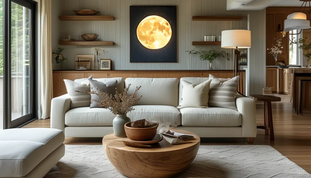
Start by determining the scale of your pattern. A large-scale pattern can make a small room feel larger and more dramatic, while a small-scale pattern can add subtle detail without overwhelming the space. Consider the room’s function and the overall mood you want to create. For a cozy bedroom, a smaller, more intricate pattern might be ideal. For a statement living room, a bold, oversized design could be the way to go.
Understand pattern repeat
The pattern repeat is the distance from one point in the pattern to the next identical point. This is crucial for seamless installation. A random match means the pattern doesn’t align perfectly across seams, making it more forgiving. A straight match aligns horizontally and vertically, requiring more precision. Drop matches, also known as half-drop or railroaded, have the pattern offset on alternating rows, which can be more complex to hang but creates a continuous flow. Always check the pattern repeat information provided by the manufacturer, as it affects how much wallpaper you’ll need and how you’ll hang it.
Choose your pattern style
Consider the existing decor in your home and the statement you want to make. For a timeless look, explore classic wallpaper patterns. If you prefer clean lines and symmetry, geometric wallpaper patterns offer a modern and structured feel. For a more eclectic and relaxed vibe, consider patterns inspired by nature or bohemian aesthetics. Modern boho wallpaper often incorporates textures and organic shapes. If you admire historical designs, the intricate artistry of William Morris wallpaper designs might appeal to you. For a touch of European elegance, look into French wallpaper patterns, which can range from delicate florals to grand damasks.
Color palette considerations
The colors you choose will significantly impact the mood and perception of the space. Light colors can make a room feel bigger and brighter, while dark colors can create a more intimate and cozy atmosphere. Consider the natural light in the room and the colors of your furniture and existing decor. A monochromatic scheme using different shades of one color can be sophisticated and calming. Alternatively, a contrasting color palette can add energy and visual interest. Ensure the colors work well together and don’t clash with your furnishings.
Contrast and harmony in color
When selecting colors for your wallpaper design, aim for a balance between contrast and harmony. High contrast, like black and white, creates a bold statement and sharp definition. Low contrast, such as shades of beige and cream, offers a softer, more subtle effect. Harmony is achieved when colors complement each other, creating a cohesive and pleasing visual experience. Think about the psychological impact of colors: blues and greens are often associated with calmness, while reds and yellows can evoke energy and warmth.
Types of wallpaper materials
The material of the wallpaper affects its durability, texture, and ease of installation. Common options include:
- Paper-backed vinyl: Durable, washable, and suitable for high-traffic areas like kitchens and bathrooms. The vinyl coating provides moisture resistance.
- Solid vinyl: Even more durable and scrubbable than paper-backed vinyl, ideal for heavily used spaces.
- Non-woven (or ‘easy-hang’): Made from a blend of paper and synthetic fibers. It’s breathable, easy to remove, and often strippable when dry. This is a popular choice for DIYers.
- Textured wallpaper: Can be made from fabric, grasscloth, or embossed materials. These add tactile interest and can hide minor wall imperfections.
- Peel-and-stick: A modern option made from vinyl or fabric with an adhesive backing. It’s easy to apply and remove, making it perfect for renters or temporary decor. Ensure the adhesive is strong enough for your application but won’t damage walls upon removal.
Calculating wallpaper quantity
To avoid running out of wallpaper mid-project, accurate measurement is key. Measure the height of your walls from the ceiling to the baseboard and the width of each wall. Divide the total square footage of your walls by the square footage covered by one roll of wallpaper. Remember to account for the pattern repeat; you’ll need extra wallpaper to align the pattern correctly. It’s always better to have a little extra than not enough. Most manufacturers recommend adding 10-15% for waste and pattern matching.
The importance of batch numbers
When ordering wallpaper, always check the batch or lot number. Rolls from different batches can have slight variations in color or texture, even if they are the same design. To ensure a consistent appearance, all the rolls you purchase for a single project should come from the same batch. This is especially critical for patterns with subtle color gradients or textures.
Preparing your walls
Proper wall preparation is as important as the wallpaper itself. Start by cleaning the walls thoroughly to remove any dust, grease, or old adhesive. Fill any holes or cracks with spackle and sand smooth once dry. If you are wallpapering over old wallpaper, ensure it is completely removed or the surface is properly primed. A primer seals the wall, provides a uniform surface, and helps with future removal. For very porous walls or dark paint colors, a high-quality primer is essential.
Priming for adhesion and removal
A good primer not only ensures your new wallpaper adheres well but also makes future removal much easier. It creates a non-porous surface that prevents the wallpaper paste from soaking too deeply into the drywall, which can cause damage. It also provides a uniform color base, so any underlying wall color doesn’t show through lighter wallpaper patterns.
Installation techniques for different patterns
For patterns with a straight match, align the edge of the new strip precisely with the edge of the previous one. For a drop match, you’ll offset the pattern on each subsequent strip. If you have a busy, intricate design, take your time at the seams to ensure perfect alignment. Using a seam roller gently can help press down edges and eliminate air bubbles. For peel-and-stick papers, work from top to bottom, smoothing out air bubbles with a squeegee as you go.
Dealing with obstacles
Around windows, doors, and electrical outlets, you’ll need to cut the wallpaper carefully. Measure and mark where the openings are on the wallpaper before applying it. For outlets, turn off the power at the breaker box first. Cut an ‘X’ in the wallpaper over the outlet opening, then fold back the flaps and trim the excess around the cover plate. A sharp utility knife and a steady hand are crucial for clean cuts.
Common mistakes to avoid
One of the most common mistakes is not ordering enough wallpaper, leading to color inconsistencies if you have to order more from a different batch. Another is poor wall preparation, resulting in peeling or bubbling. Rushing the installation process, especially with complex patterns or drop matches, is also a frequent error that leads to misaligned seams and a less professional finish. Always follow the manufacturer’s instructions for paste and application.
Designing wallpaper patterns for specific rooms
Living rooms
Living rooms are often focal points. Consider bold, large-scale patterns, or opt for subtle textures that add warmth. You can use wallpaper on an accent wall or all four walls. For a cohesive look, ensure the pattern complements your furniture and existing color scheme.
Bedrooms
Bedrooms are spaces for relaxation. Softer, more muted patterns or calming colors are usually preferred. Consider floral, abstract, or nature-inspired designs. A subtle textured wallpaper can add a cozy feel without being visually overwhelming.
Kitchens and bathrooms
These areas require durable, washable, and moisture-resistant wallpaper. Vinyl or solid vinyl options are ideal. Patterns can range from playful motifs to elegant subway tiles or geometric designs. Ensure proper ventilation to prevent moisture buildup.
Hallways and entryways
These are transitional spaces. You can make a statement with a bold pattern or a striking color to welcome guests. Consider patterns that are easy to clean, as these areas can experience high traffic.
The role of digital design tools
For those creating custom designs, digital tools are invaluable. Software like Adobe Photoshop or Illustrator allows you to create intricate patterns, experiment with colors, and scale designs before printing. Many online services offer custom wallpaper printing based on your digital files, giving you complete creative control over your home decor.
Vector vs. Raster graphics
When designing for print, understanding the difference between vector and raster graphics is important. Vector graphics (created in programs like Adobe Illustrator) are made of mathematical paths and can be scaled infinitely without losing quality, making them ideal for wallpaper patterns. Raster graphics (like JPEGs or PNGs from Photoshop) are made of pixels and will become pixelated if enlarged too much, which can ruin a design intended for large-format printing.
Trends in wallpaper pattern design
Current trends include maximalism, with bold, vibrant, and often maximalist designs making a statement. Biophilic design, incorporating nature-inspired motifs like leaves, botanicals, and organic textures, continues to be popular for creating calming environments. Geometric patterns are also having a resurgence, offering both classic and contemporary looks. Textural wallpapers are also on the rise, adding depth and sensory appeal to walls.
Sustainability in wallpaper
Consider eco-friendly options when designing and selecting wallpaper. Many manufacturers now offer wallpapers made from recycled materials, sustainable inks, and natural fibers. Look for certifications that indicate environmentally responsible production practices. This ensures your beautiful designs also contribute to a healthier planet.